The Kruidvat redesign is a new responsive website redesign of Kruidvats existing website to bring the site inline with new brand guidelines, implement UX enhancements and to make it more engaging for users. My role was to research user behaviours on existing website, work with stakeholders to scope out new functionality, conduct user testing and produce fully interactive wireframes for the new designs across all devices.
PROJECT SUMMARY
Objective
| Project Information | Details |
| Project Name | Kruidvat Website Redesign |
| Project Tagline | Kruidvat response website redesign with new UX enhancements |
| Project Summary | Redesign the Kruidvat website to bring it inline with new brand guidelines, make it more contemporary and introduce some new UX features to improve the sites UX |
| Client Name | Kruidvat |
| Project Dates | 15/10/17 – 29/10/18 |
| My Major Tasks & Responsibilities | User research, user testing, wireframing and interaction design |
| Platforms | Hybris Website |
| Design Tools / UX Methods Used | Axure, Photoshop, GA, Hotjar |
| Key Performance Metrics | User engagement metrics: Conversion rate, bounce rate, pageviews (including PDP), cart to transaction rate |
| Team Members & Collaborators | UX Designer: Phil (me), Change Management Lead: Fabrizio, Website Manager: David, Dev Ops Manager: Ralph, BU Director: Roland, Visual Designer: Chris |
| Link to Final Project | www.kruidvat.nl |
DISCOVERY PHASE
Project Kick Off
To kick off the project and to properly understand the project goals, we arranged a kick off meeting hosted at our London offices and made sure that we had all the relevant stakeholders in the room. This would mean all parties that would be involved in the project would have the opportunity to ask questions before work started.
In the meeting Kruidvat presented their ecommerce vision for the next three years, technical roadmap for the year ahead and outlined the goals of the redesign project.
")
Phil (Me)
UX Designer

Chris
Visual Designer

David
eComm Manager

Ralph
BU Dev Ops Manager

Fabrizio
Change Management Lead

Roland
BU eCommerce Director
Project Objectives
Following the kickoff meeting, it was communicated clearly to us that Kruidvat’s three main objectives of the redesign project were:
Design Approach
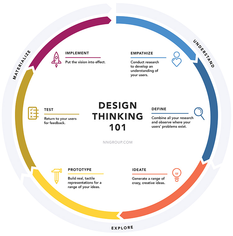
Before we kicked off the project I explained to the team how we must approach the project using Jakob Nielsen design thinking 101 methodology. I explained to the team how this must form the basis of our approach to each phase of the redesign – this approach was widely accepted and adopted by all key stakeholders.
Store visits
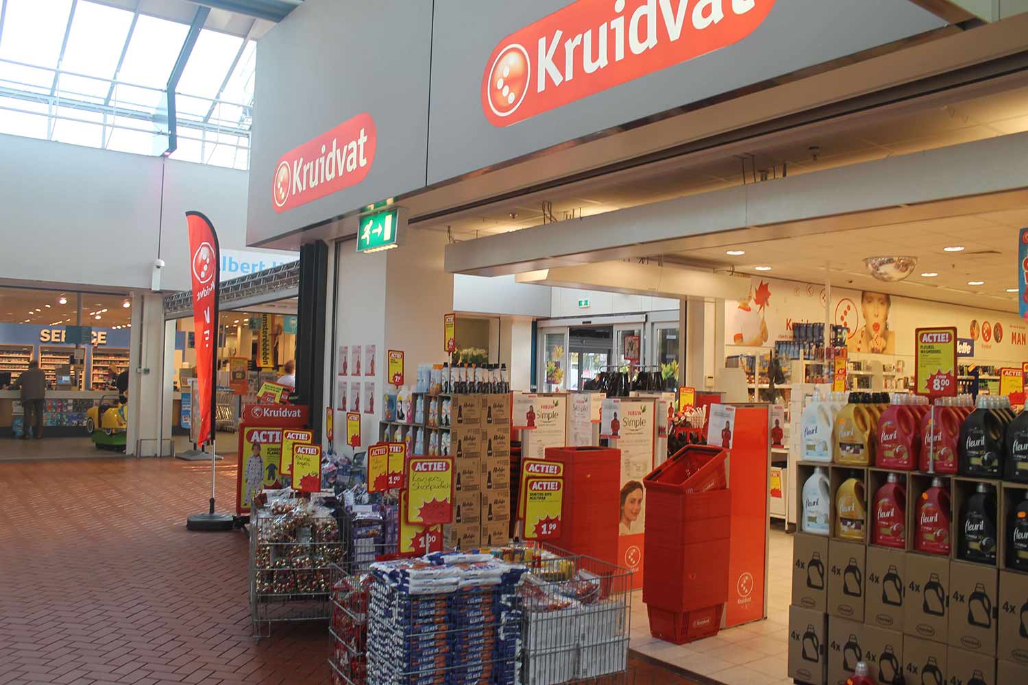
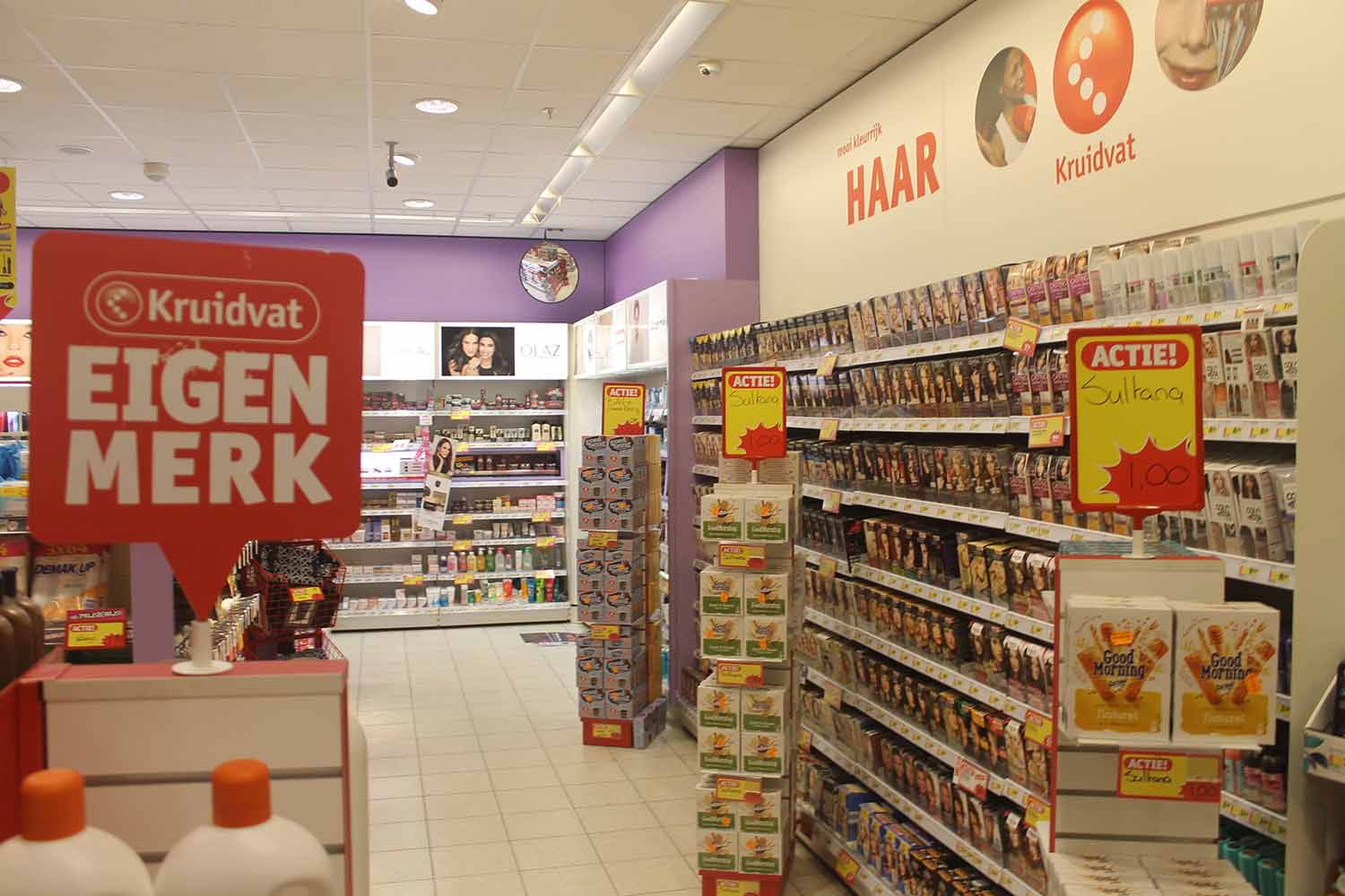
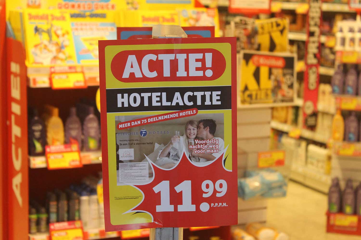
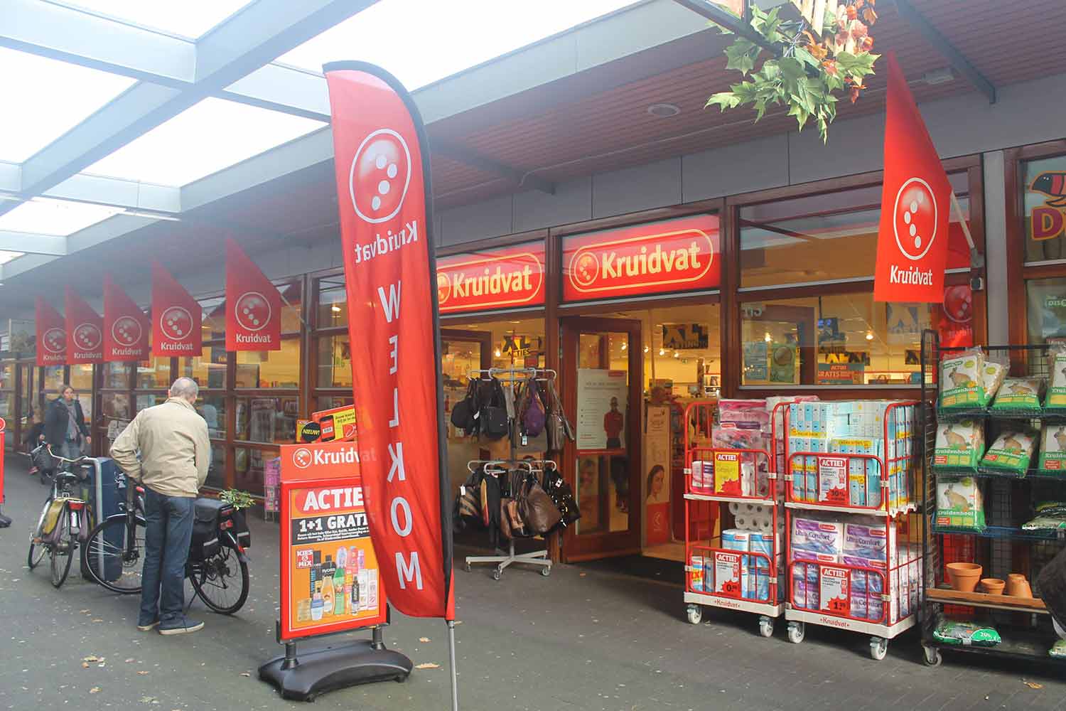
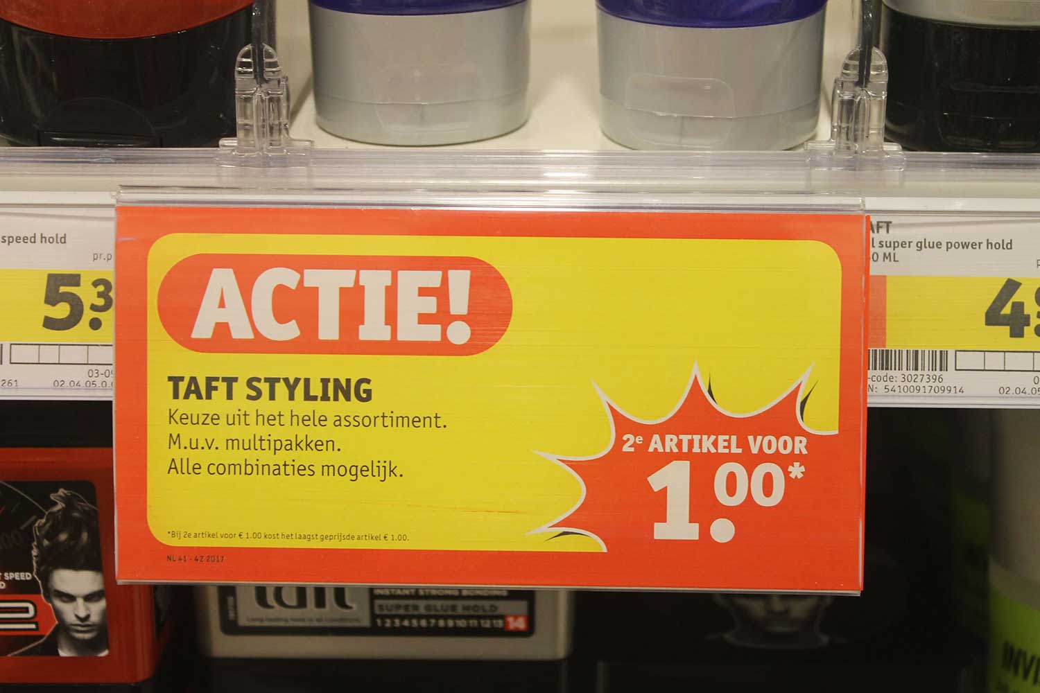
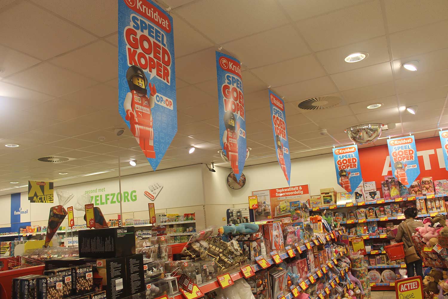
A very important goal of the redesign that was emphasised during the project kick off meeting was how the redesign must adhere to new brand guidelines and to align with stores so that the brand is consistent online and offline. As this was the first design project we did for Kruidvat, it was important that we immersed ourselves in the brand to understand Kruidvat from the customer’s perspective and from a visual point of view. To achieve this we decided a good approach would be to send the lead visual designer to visit some of the Kruidvat stores in Amsterdam Netherlands. This would not only allow us to get closer to the brand but also enable our lead designer to understand how visuals are used in store so we could replicate this in our online designs.
Store 1:


Store 2:


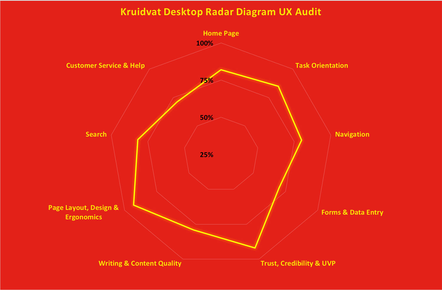
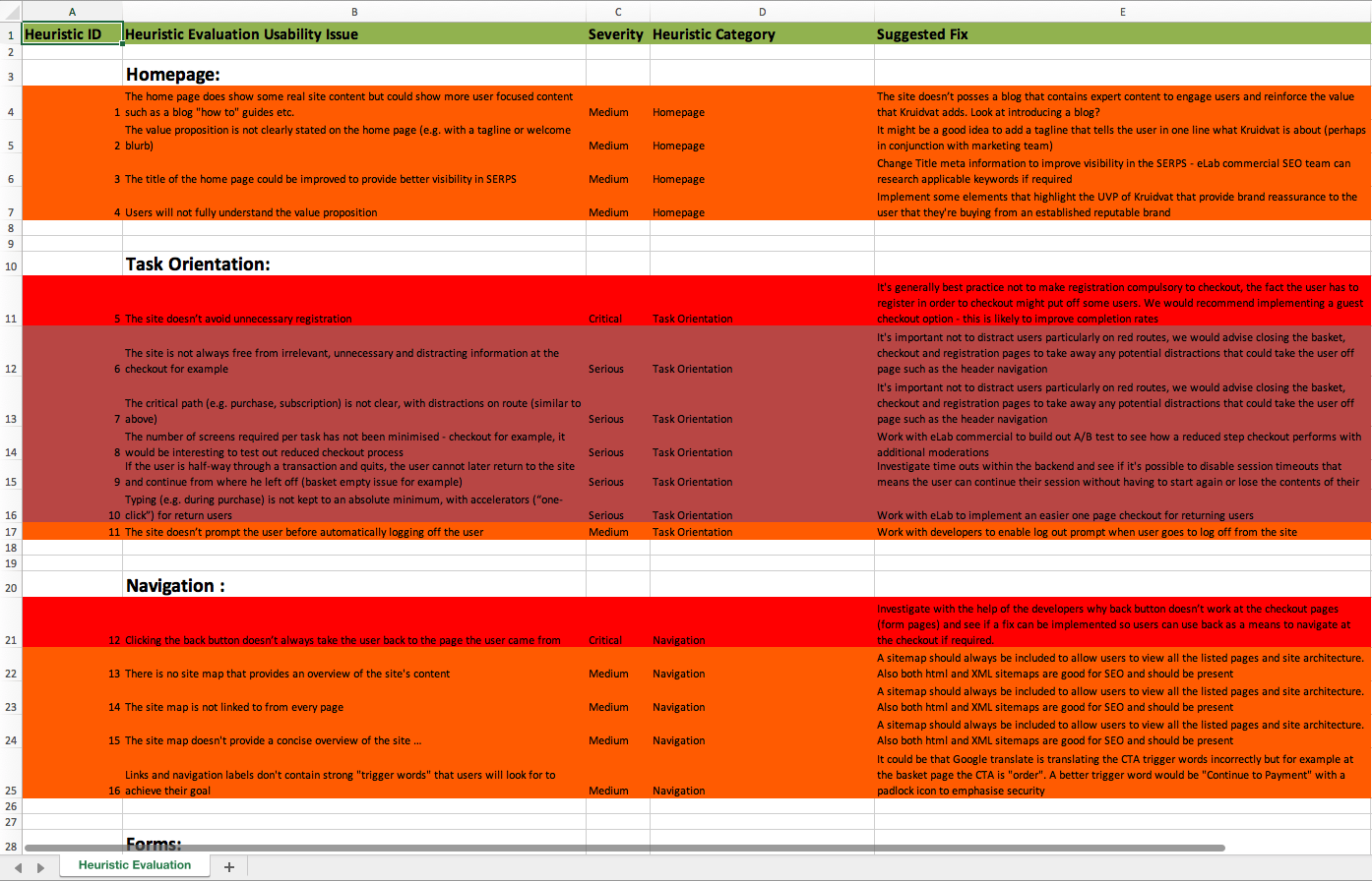
Heuristic Evaluation
To kick off the design phase, I wanted to get an understanding of the current website to see how it stacked up from a UX point of view so I carried out an expert review of the desktop site assessing the website against a set of heuristics (best practices). This approach allowed me to conduct a deep dive of all areas of the site in a relatively short space of time and give the site a rating overall. My review involved me assessing the following areas related to Nielsen’s 10 principles for interaction design:
Overall the site score was positive with a rating of 80% but the evaluation highlighted focus areas for improvement including:
Checkout styling: Too many areas of cognitive friction
Error prevention site wide: The need for better form validation to hold the users hand through key user journeys
Navigation: The need for a more intuitive navigation on mobile that would allow customers to get to key pages quicker
Remote User Testing
Along with my heuristic evaluation and analytical insights, I also conducted some remote user testing on the current site to understand the site from the customer’s perspective. To identify potential pain points, I set up ten remote user tests using What Users Do platform assigning key tasks to a panel with similar demographics to that of Kruidvat customers. I created a testing script asking users to complete a number of key tasks including checkout and registration across all devices and then analysed the findings.
Watching the way some of the users struggled to complete the tasks was really eye opening. The main areas that users flagged friction were the same identified in my expert review mainly:
- Error prevention at form entry pages affecting completion rates
- Navigation issues from deep within the site across mobile
- Visual design outdated causing too much cognitive friction site wide
Snippet from remote user test showing poor error prevention with user struggling to get to next step in registration process.
Client Briefing
Now that I had some solid research of how users were interacting with the site, it was time to get some detailed information from the BU on their requirements across the key pages. As there were some functional/UX improvements required that we weren’t aware of it was important that the BU provided us a design brief so we didn’t miss anything during the design phase. Surprisingly, this actually proved to be quite challenging as the BU took quite some time providing briefs so too make it more manageable we divided the project into three main batches so myself and the visual design lead could work in a conveyor belt type approach that would keep the project moving.
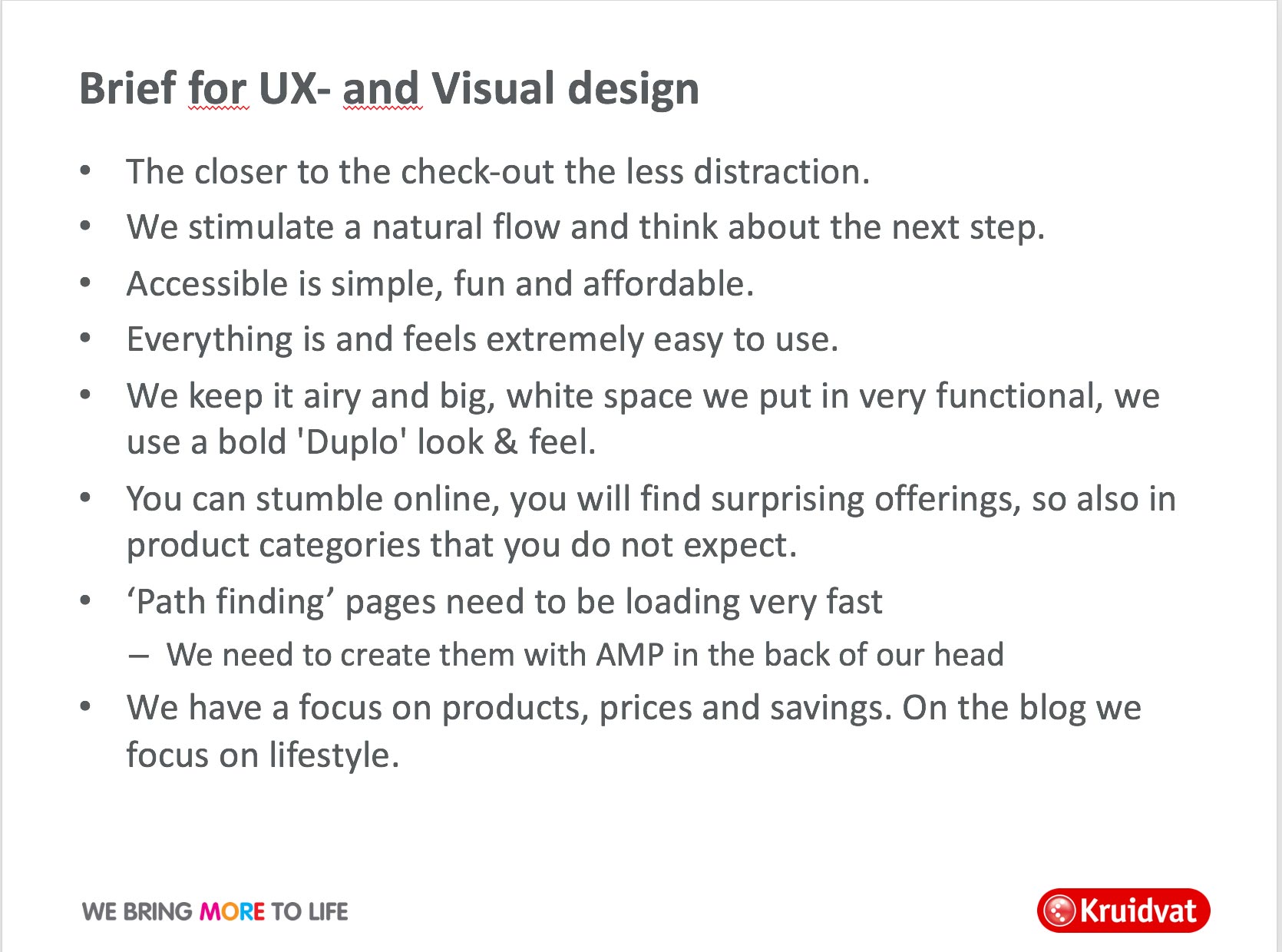
Based on the client briefing, some of the UX enhancements I had to be mindful of how I was going to factor into the designs were:
- More prominent search across all devices
- Interactive upsell pop out feature at PDP’s (post add to bag)
- Revised nav for mobile
- Better visuals for promotions
- Easier to get into key user journeys such as checkout
- Blog integration
Summarised Findings
Based on all my UX research and the client briefing the following are the UX improvements I was going to have to make during the design phase:

Key Issue
Search
More prominent search across all devices

Key Issue
User Journey
Easier to get into key user journeys such as checkout

Key Issue
Up-sells
Interactive upsell pop out feature at PDP’s (post add to bag)

Key Issue
Blog
Think about how and where I could integrate the blog across key pages

Key Issue
Navigation
Revised nav for mobile

Key Issue
Error Prevention
Improve error prevention site wide

Key Issue
Promotions
Better visuals for promotions

Key Issue
Cognitive Friction
Reduce user mental load during key journeys such as checkout
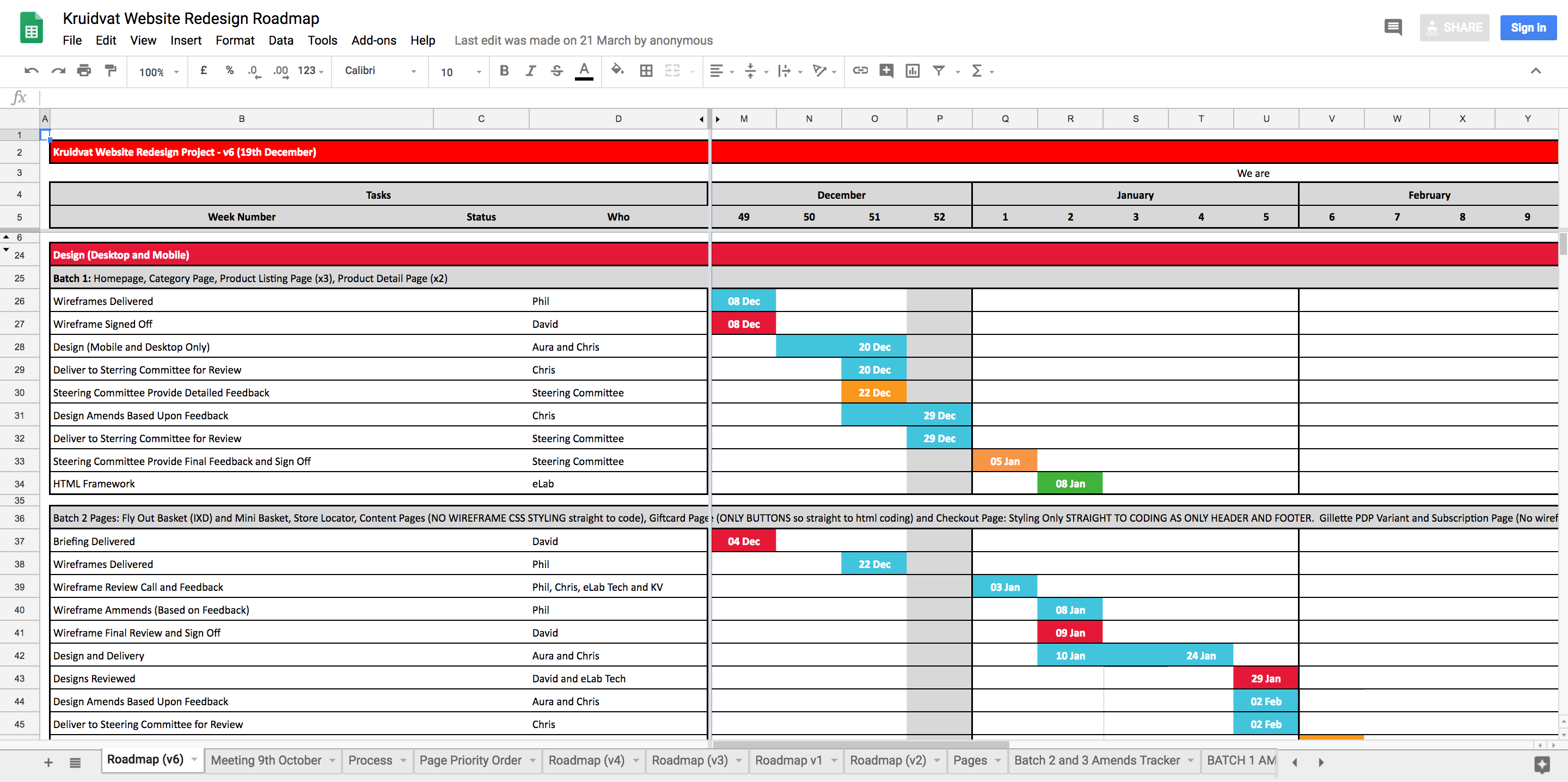
Roadmap
Now that we had completed the research phase and generated requirements it was time for all stakeholders to align on the timeframes for their respective role. As there was pressure from the BU to complete this project quickly I estimated four weeks in total for the wireframes for all pages. In hindsight I should have pushed back more and allowed more time as I felt this rushed some of the key pages nonetheless I completed the wire frames in the specified time.
DESIGN PHASE
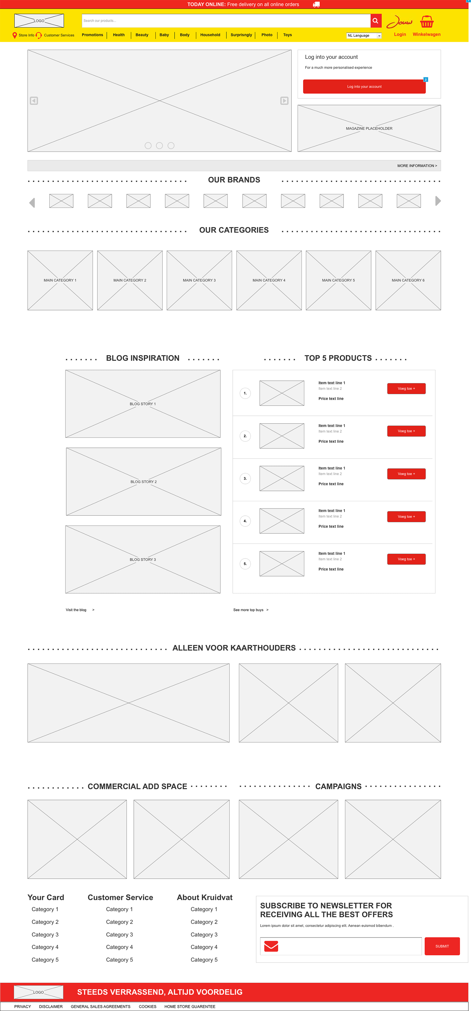
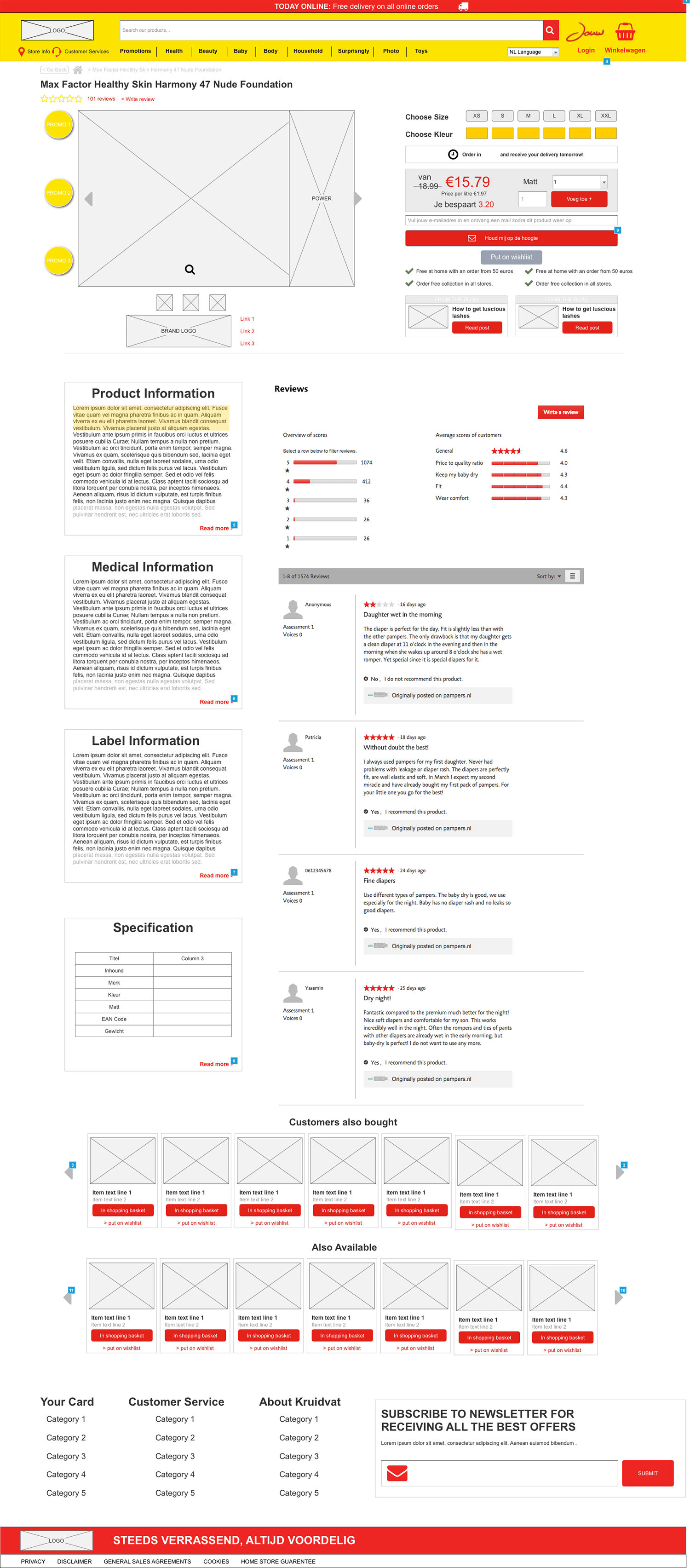
Wireframing
To help counter some of the issues I experienced with the design briefs supplied by Kruidvat being a bit light, I thought a good way to extract more detail would be to conduct wireframing sessions in real time with David the Ecommerce Manager. This approach would allow me to ask him questions on different components iterating as we went and would also provide Kruidvat the opportunity to make changes in real time. As the design phases were split into batches of key pages, I set up three separate wireframing sessions at our London office and was joined by David from the Netherlands.
It was during these wireframing sessions I set about addressing the issues I found previously during my research phase, in the client briefing and stated in the requirements document.
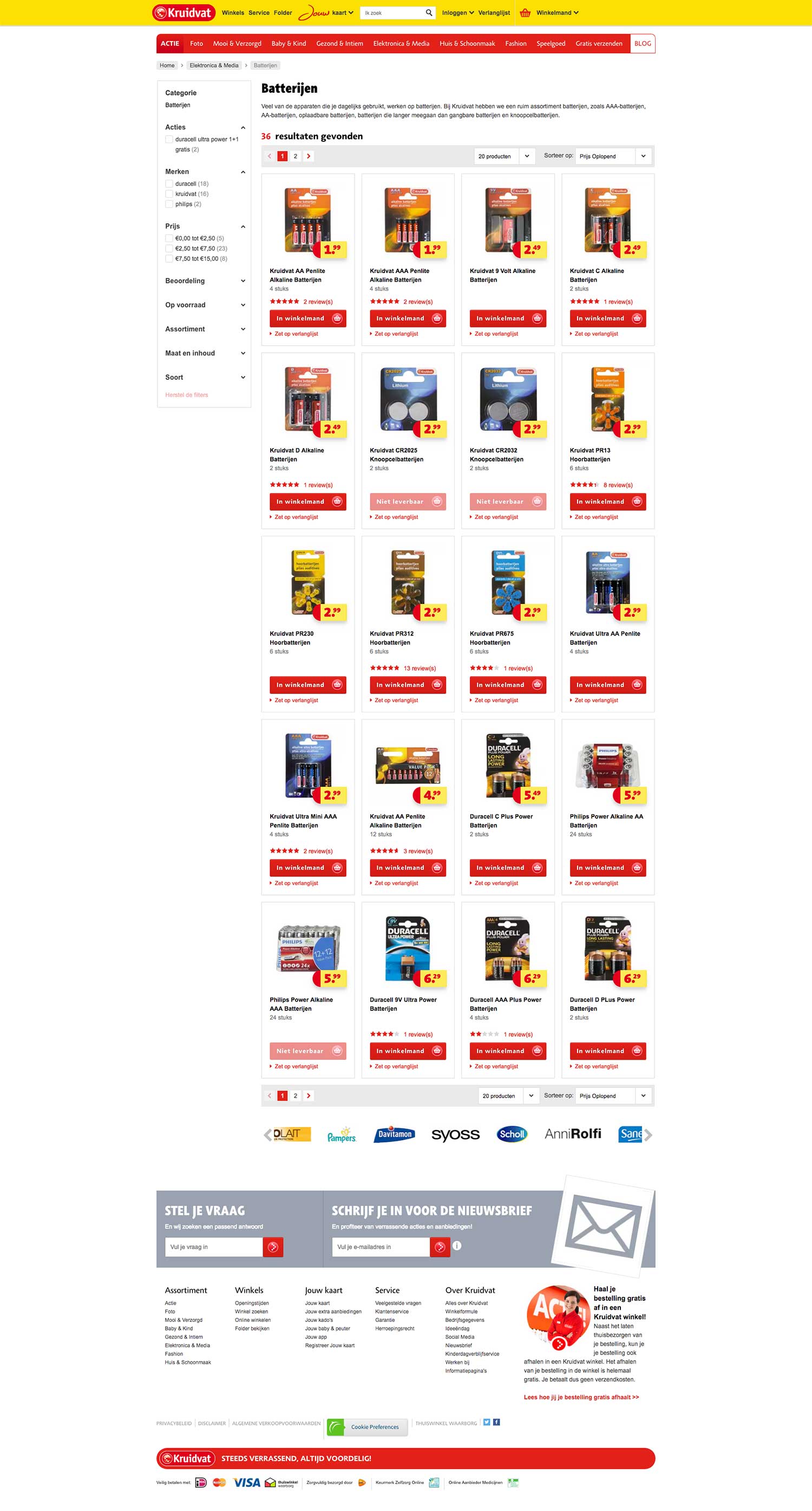
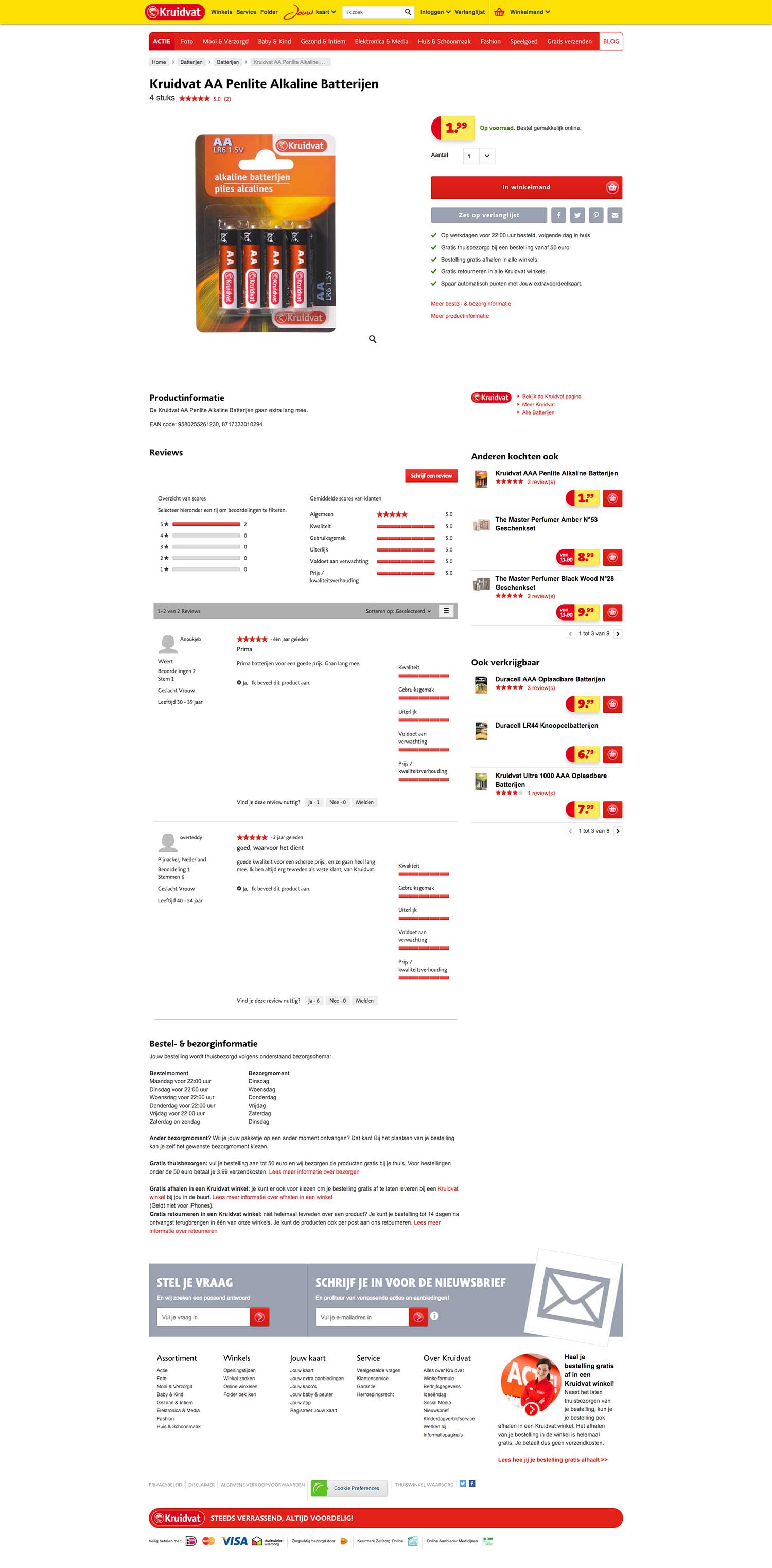
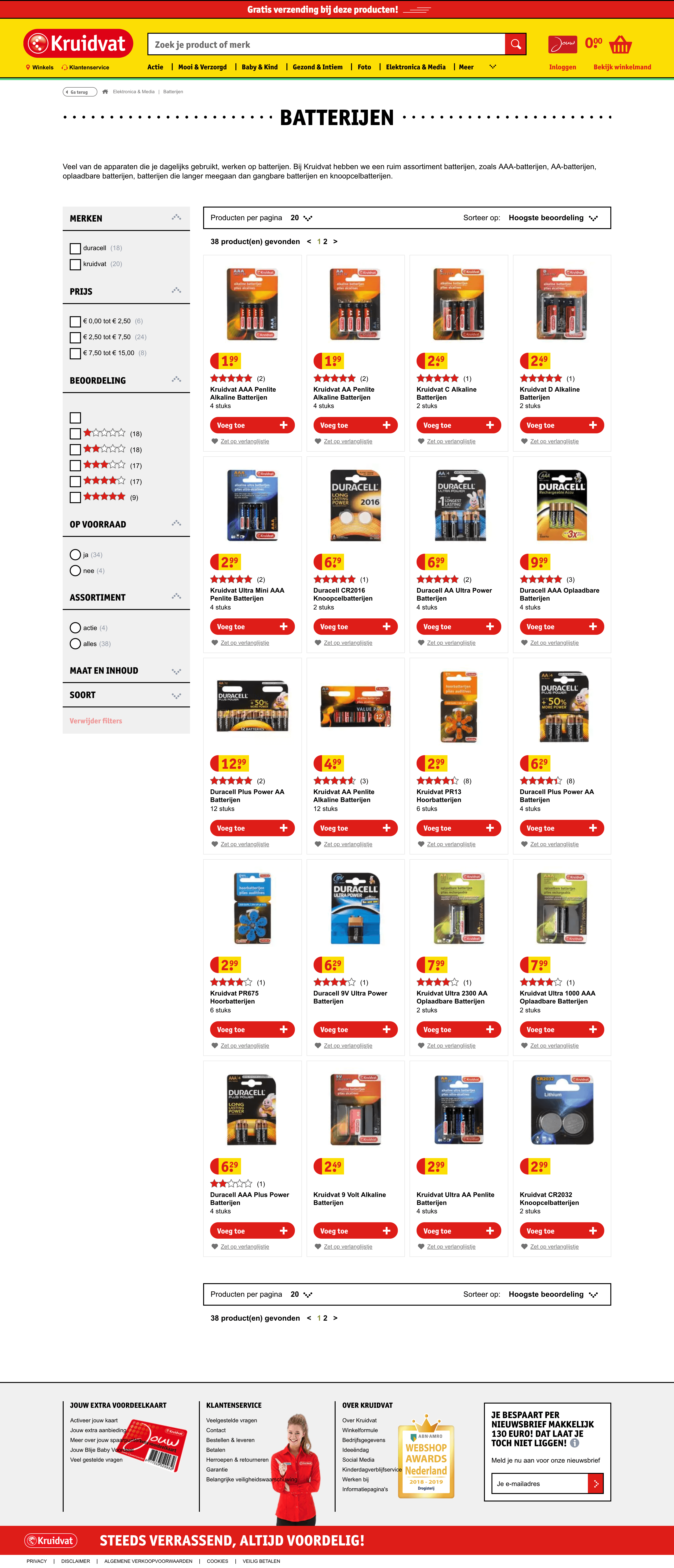
Sample Desktop Wireframes


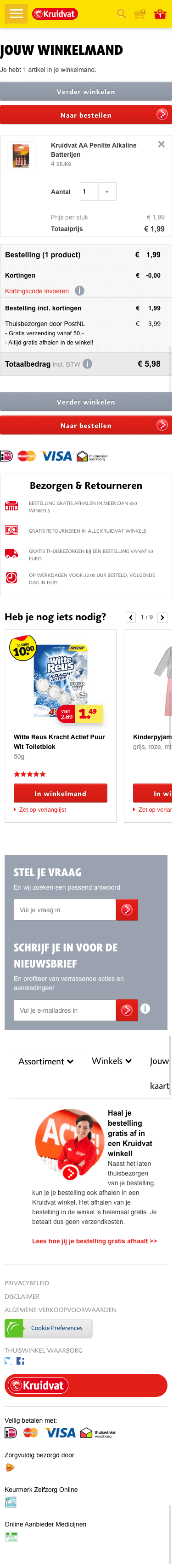
Sample Mobile Wireframes


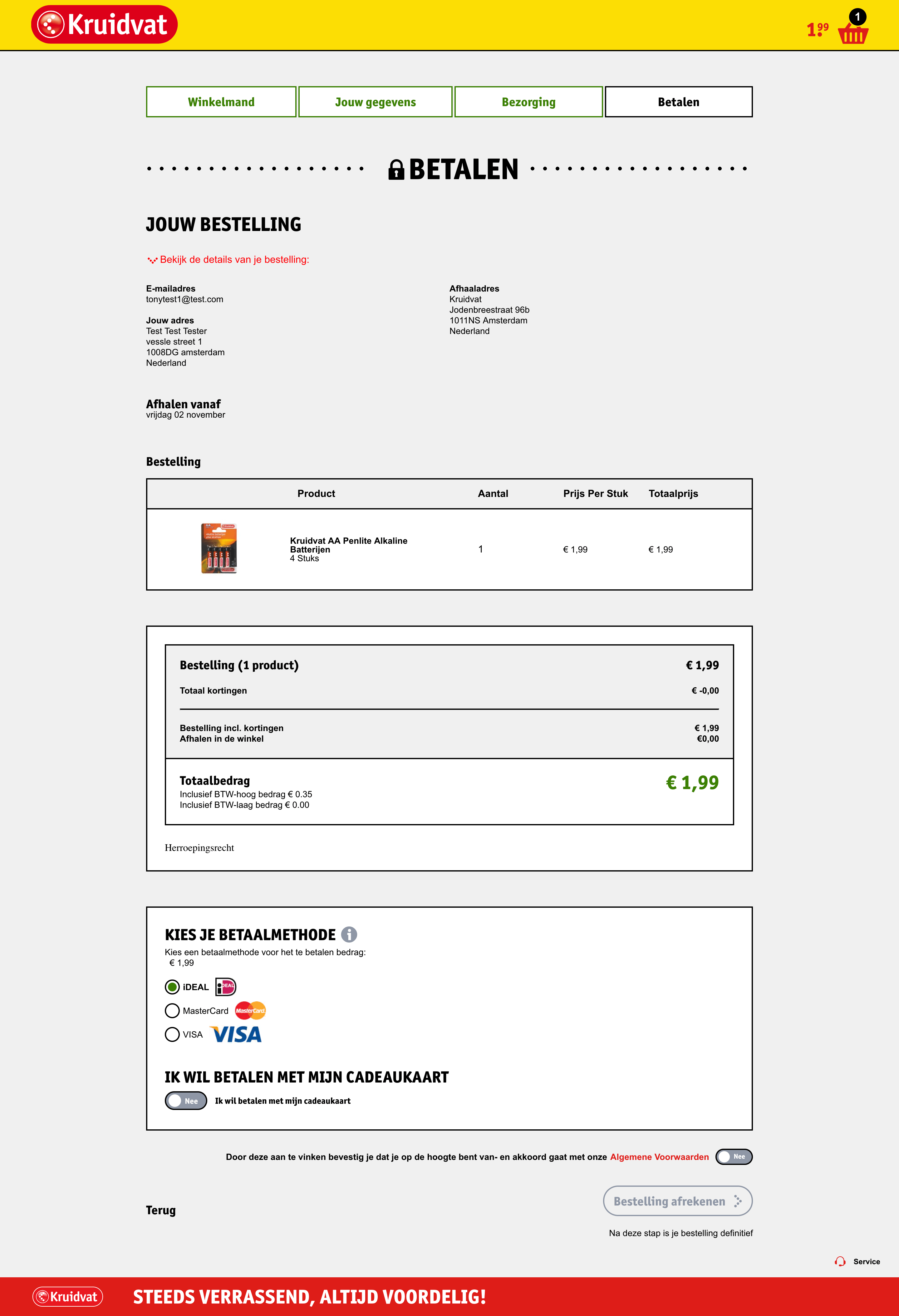
Prototyping
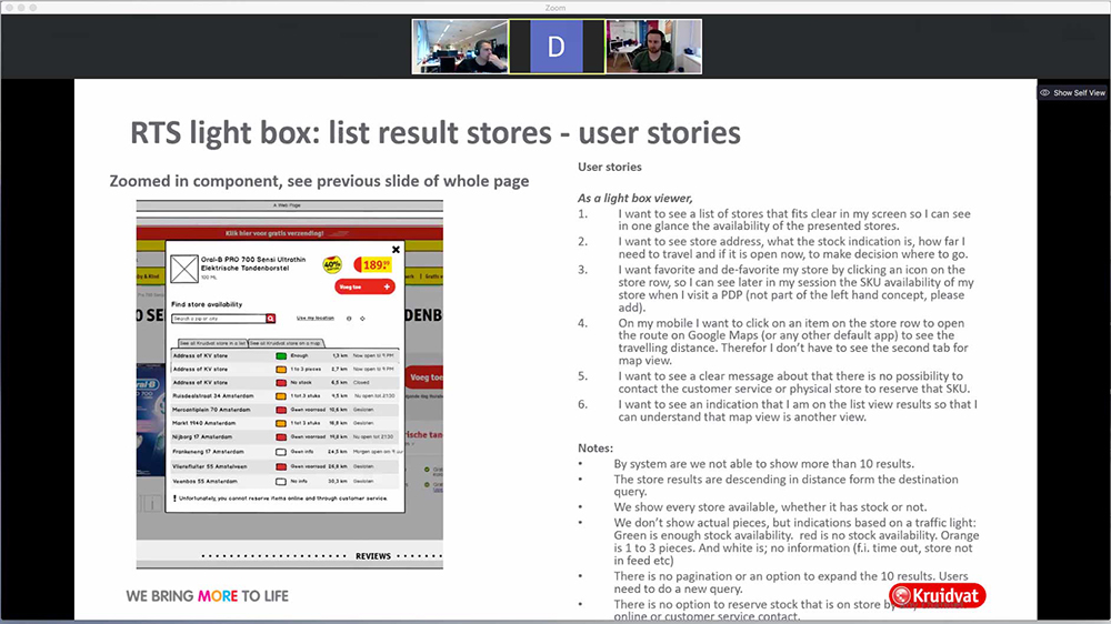
In the same wireframing sessions I killed two birds with one stone by also factoring in some prototyping specifying the IXD of new components and UX enhancements. Using Axure I built the IXD for the new features making sure they behaved in the intended way as specified by Kruidvat, but also making sure they adhered to UX best practice. The prototypes were reviewed throughout the design phase by the Fabrizio’s team validating that the components could be developed as intended – this practice proved beneficial for all stakeholders.
IXD snippet of how I addressed the interactive up-sell requirement on PDP’s
Visual Designs
Now that the lion share of the early part of the design phase was complete it was time to pass it to the visual design team to bring the wireframes and mockups to life. I worked very closely with our Visual Design Lead Chris, to make sure that the designs were representative of the wireframes.
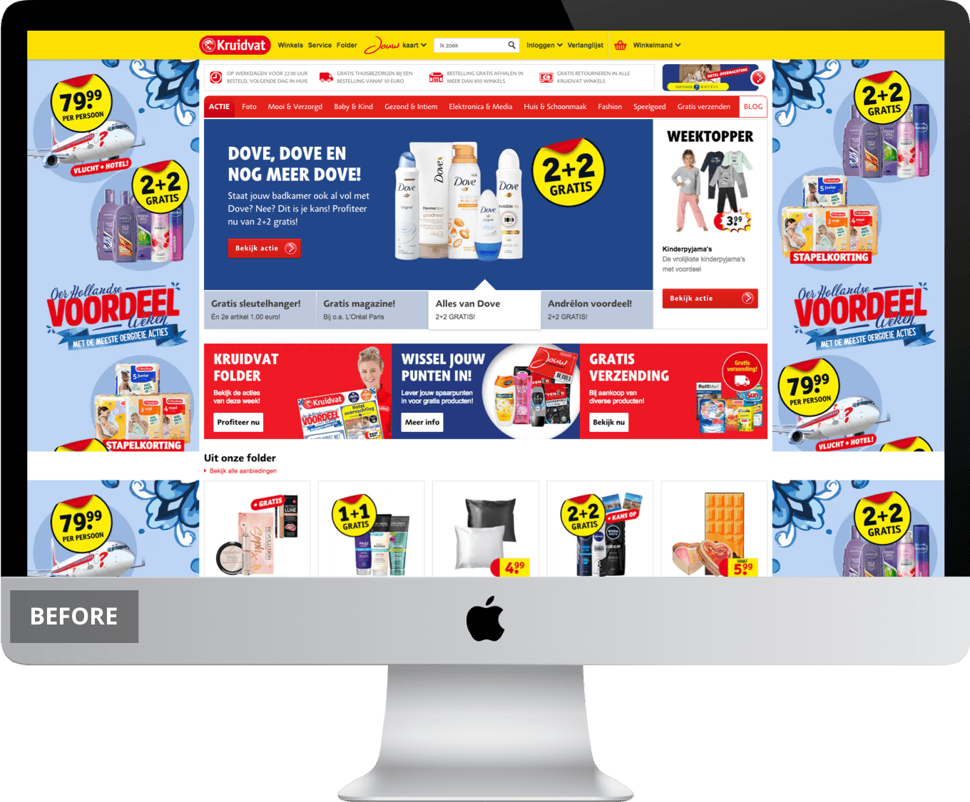
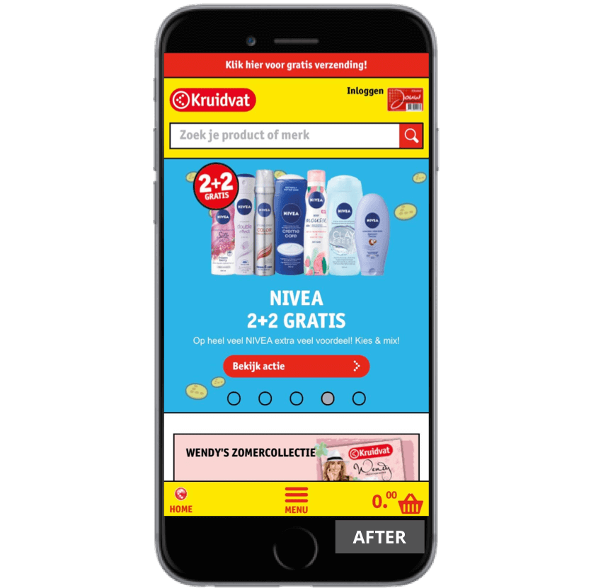
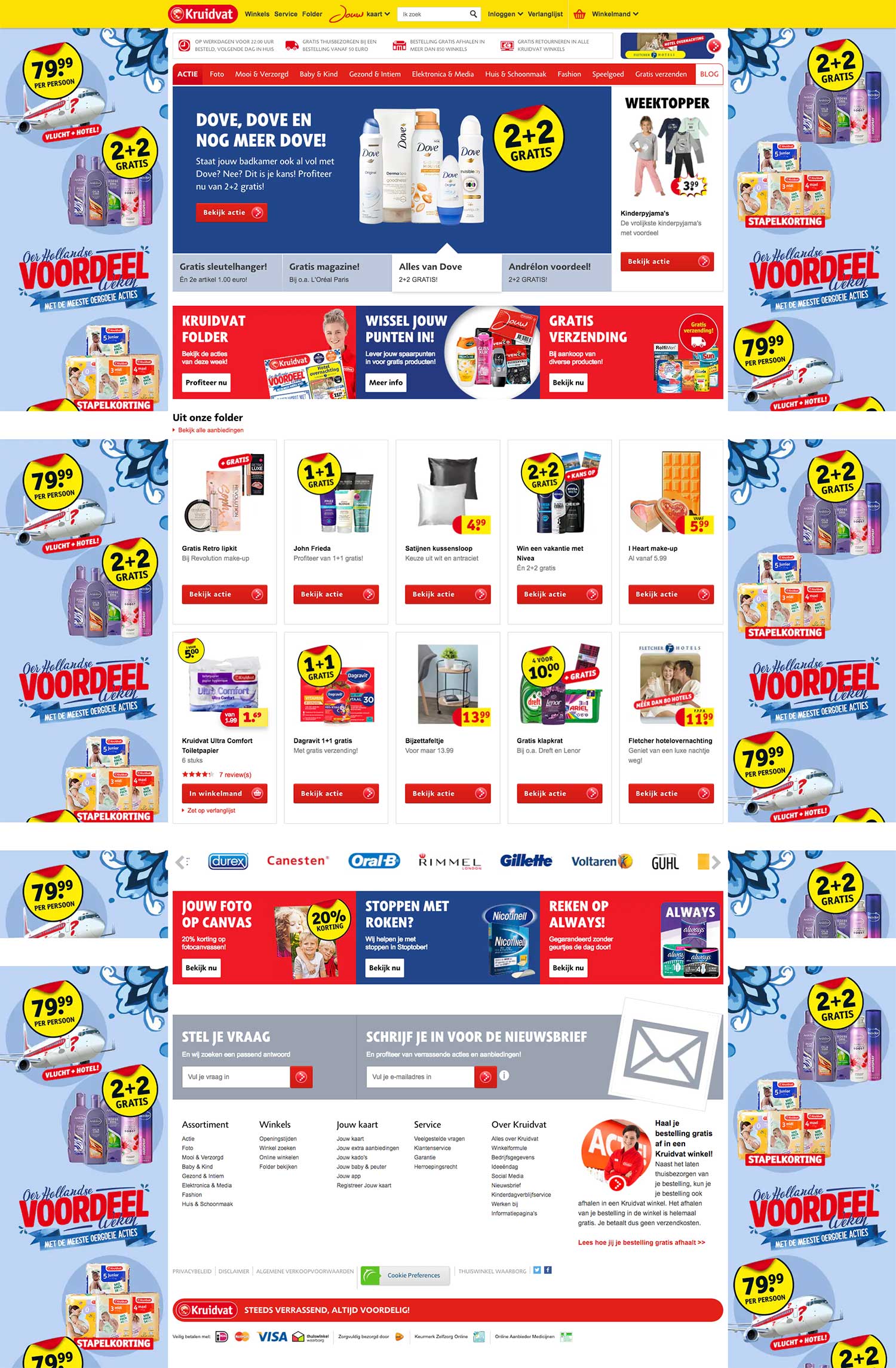
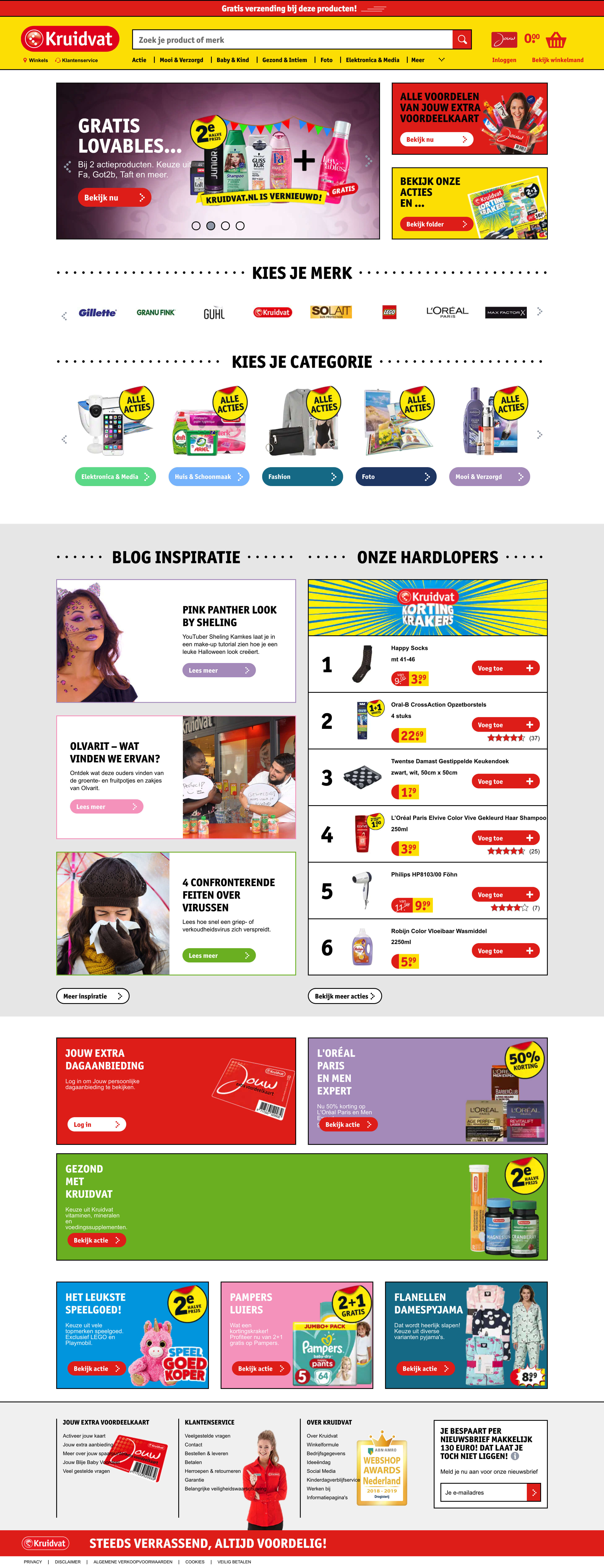
Sample Old Desktop Designs:


Key UX Changes
Based on my UX research and the BU requirements communicated during the client briefing the following shows how I addressed these and factored them into my designs.
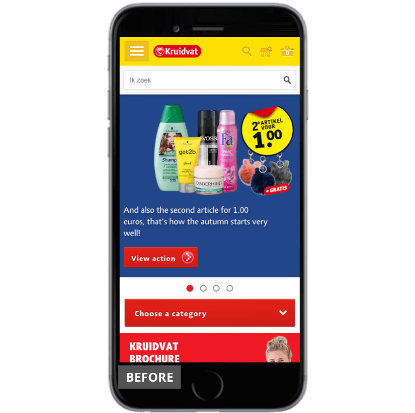
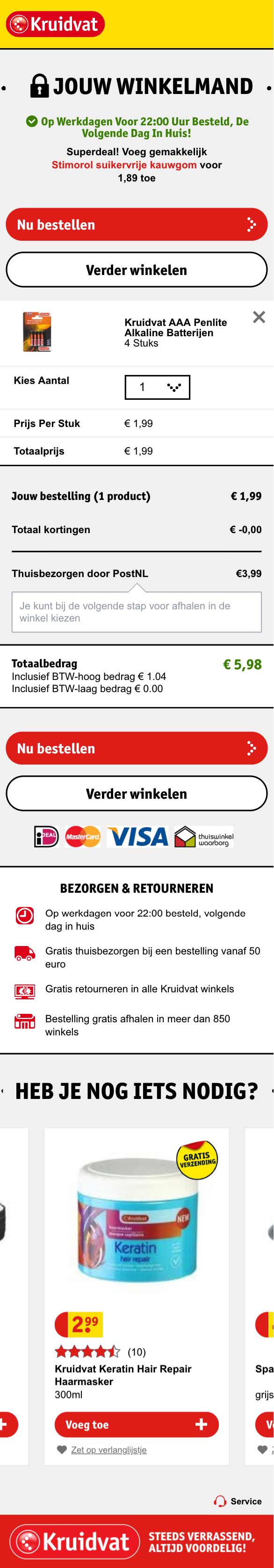
Mobile Changes:
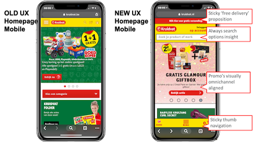
The above shows how I introduced the following into my designs:
Sticky proposition in head of page: This allows the client to communicate key USP’s at during different promotions and time of year, Black Friday for example
Search prominence: I made sure that search was always available either in the head of the page or within the sticky menu if the user is scrolling
Promotions: Better use of visuals for promotions so they were aligned with in-store campaigns
Navigation: I revamped the navigation so it was sticky in the footer of the page near the users thumb at all times
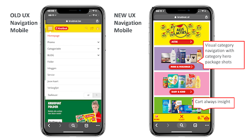
The above shows how I introduced the following into my designs:
Visual Category Nav: I revamped the nav to follow a visual style using a “hub and spoke” method to make it more intuitive for users
Checkout Journey: I made the checkout journey visible site wide regardless of where the user was by placing the basket on the sticky footer nav
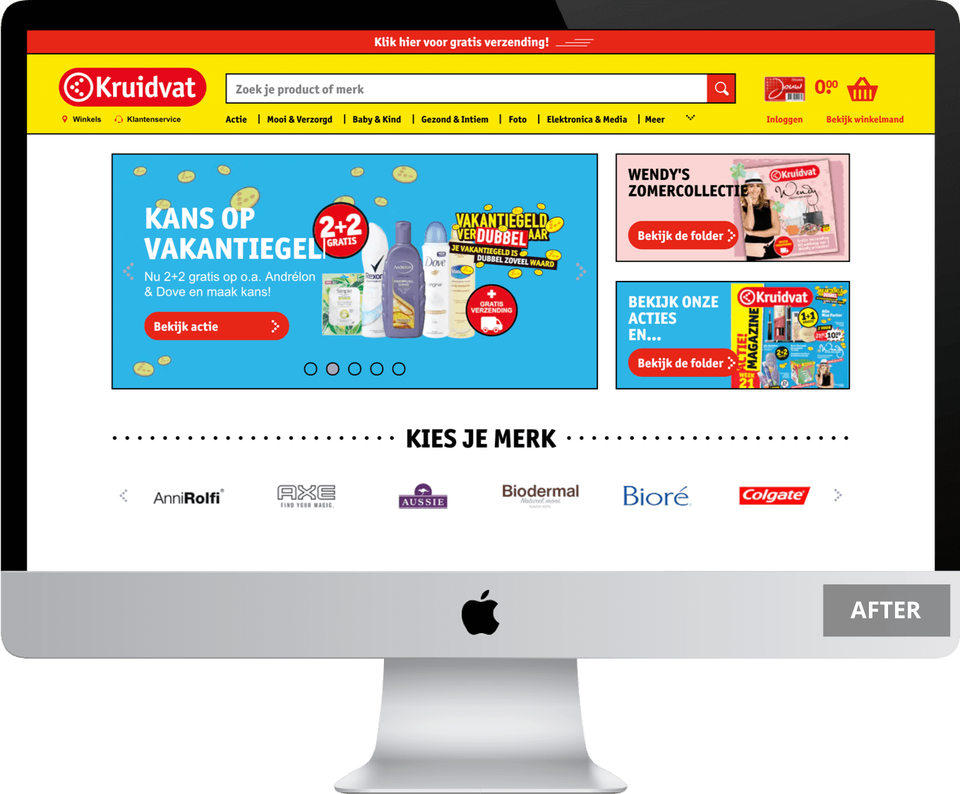
Desktop Changes:
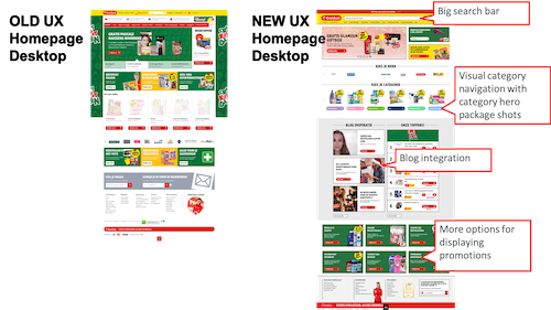
The above shows how I introduced the following into my designs:
Prominent search bar: Based on the data, users are five times more likely to convert having search versus non-search therefore I made the search bar almost full width of the site in the sticky header nav
Visual category nav: I introduced a visual category navigation that was more visual rather than word based and allowed users to scroll from left to right
Blog integration: I integrated the blog across key pages of the site as sessions with blog visits had a higher propensity to convert
Better promo options: I also introduced more promo components that would allow the client to do more online promotions similar to in-store
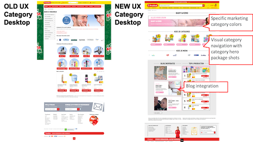
Similar to desktop changes, the above shows how I introduced the following into my designs on category pages:
Colour coded nav: I introduced a colour coded nav so that it gave the user additional sign posting to tell them what category they were in
Visual category nav: I introduced a visual category navigation that was more visual rather than word based and allowed users to scroll from left to right
Blog integration: I integrated the blog across key pages of the site as sessions with blog visits had a higher propensity to convert
DEVELOPMENT PHASE
Pre Go Live
Having kept within our strict timelines it was time to pass all UX & design assets over to our development team. The development phase through up some challenges mainly unexpected code issues that required more work than previously anticipated that delayed the project slightly. Even though this was challenging at the time, it was a great test of our stakeholder management and even with the delays we were able to form some very good relationships with the Kruidvat Stakeholders.
The newly designed site went live on 22/10/18.
RESULTS & LEARNINGS
Results
15
Conversion Rate %
1
ATV %
19
Avg Page Views %
12
Reduction in Bounce Rate %
35
SERP Page Views %
123
Blog Pageviews %
36
PDP Pageviews %
37
Visit to Cart %
6
Cart to Transaction Rate %
Learnings
I learnt a lot from this redesign project that I can take forward into other big redesign projects. There were many key learnings but I think the biggest two learnings I took away were:
- Stakeholder management: Firstly, forming cohesion between all key stakeholders and teams in the project is critical to making sure everyone is aligned on what they need to deliver. We did this in a variety of ways from weekly calls, face to face meetings etc. If any team or stakeholder started operating in a bubble the project would have fallen apart.
- Design Sprints: Secondly, operating in an agile approach splitting the site pages into sprints worked really well. It kind of worked as a conveyor belt each part of the project got passed to next team to begin work so we constantly kept the project moving simultaneously.
Overall, this was a fantastic large scale project to be a part of working with stakeholders across three countries fulfilling the brief with some great post launch results that formed a great working relationship moving forward.
Testimonial
“Dear All - After more than a year very very hard and intensive work we are almost 4 days live with our redesigned Kruidvat.nl. Congratulations and many thanks to you all!Great collaboration between different departments in our BU (marketing, CRM, ecommerce, etc.), eLab London, eLab Milan and of course our friend from EPAM in the Ukraine!Since Monday we haven't had any significant issues, internal and external reactions are very positive and first trading results look very promising . We all can be very proud in this achievement!I think the new site is a huge improvement in terms of UX, design and Kruidvat branding. I trust that this will boost our conversion significantly - and we need it because our ambitions and targets for next year are stretching again .While it is much more a commercial webshop now , other very important elements like inspiring content and JEVK have more prominent positions on the site . A total fit with the ROPO shoppers that visit our site.More to come. Together, we will continue redesigning our Belgium site and further improving Kruidvat.nl true delivery of our roadmap.”
Roland van den BergManaging Director & Director eCommerce at A.S. Watson Group