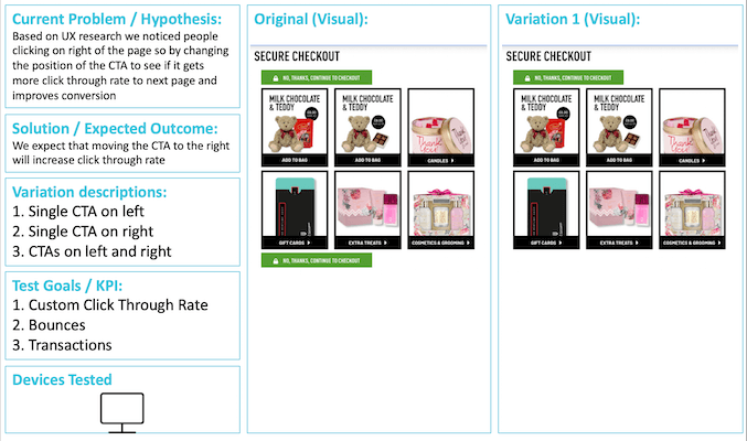
The Perfume Shop one page checkout is a new nested checkout designed to make it easier for The Perfume Shop customers to check out consequently improving checkout completion rates. It solves usability issues on their existing checkout, reduces the number of steps, cognitive friction and time on task. My role was to research the current checkout process identifying ways of making it quicker and easier for users to checkout. I collaborated with a variety of stakeholders across the business including the Business Unit (BU), our development and design teams.
PROJECT SUMMARY
| Project Information | Details |
| Project Name | The Perfume Shop Nested Checkout |
| Project Tagline | Making checkout seamless for The Perfume Shop users |
| Project Summary | The Perfume Shop is one of the largest luxury fragrance retailers in the UK and their website is to facilitate online sales. My role was to research, existing checkout process identifying usability issues and areas for improvement resulting in redesign if necessary to make the process easier for customers. |
| Client | The Perfume Shop |
| Project Date | 01/06/17 – 31/08/18 |
| My Tasks & Responsibilities | Develop the UX and all IXD for a new nested one step checkout |
| Platform | Hybris Website |
| Design Tools | Balsamiq, Axure, Google Optimize, What Users Do, GA, Hotjar, Sketch |
| Key Performance Metrics | Checkout conversion rate, basket abandonment rate, time on task, user rating (Likert scale) |
| Team Members & Collaborators | UX Designer: Phil (me), Technical Lead: Marco, Business Unit Manager: Hannah, Visual Designer: Ross |
| Link to Final Project | www.theperfumeshop.co.uk/cart |
DISCOVERY
Heatmaps
Heatmaps:
To kick off the project, I wanted to get a decent understanding of the existing checkout process and how users were interacting with it and identify any undiagnosed usability issues. I started by employing some qualitative and quantitative techniques to get a holistic view of the current user experience.
Basket Scroll & Click Maps:
To begin with, I started by setting up heatmaps across all devices using Hotjar on each step of the checkout process. This enabled me to identify high click through rate areas, scroll depth and areas of frequent mouse movement that might indicate user frustration. At the basket level I found little areas of high click through rate and that there was only one “continue” CTA that gets the user into the checkout funnel located in the footer of the page. The CTA was only being reached by 65% of users so there was a clear need that we needed a fixed CTA that stays visible to all users 100% of the time. I also noticed that 20% of clicks were on the voucher code but this field is not accessible if user clicks “checkout” directly within the Ajax basket. This means users that opted for this user journey would miss the opportunity to enter a voucher code and could possibly result in a lost sale if it couldn’t be located during their session.
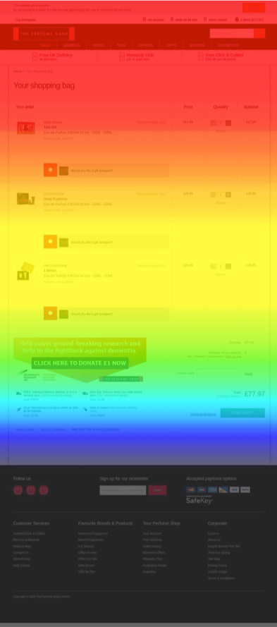
Only 65% of users reached here
20% of total page clicks
40% of total page clicks
Funnels
With the insights drawn from the heatmaps I was interested to see if there were any significant drop off areas at each step of the checkout so I set up some funnels using GA and Hotjar. Interestingly, the funnels mirrored the heatmap findings with both basket and step 2 being high drop off rate errors losing a significant number of potential customers. Not only this, but I noticed a worrying looping issue when comparing the new redesign funnel (design went live in 2016) with the previous design funnel. This meant that a large proportion of customers were getting themselves in some kind of loop that was essentially taking them out of the checkout funnel.
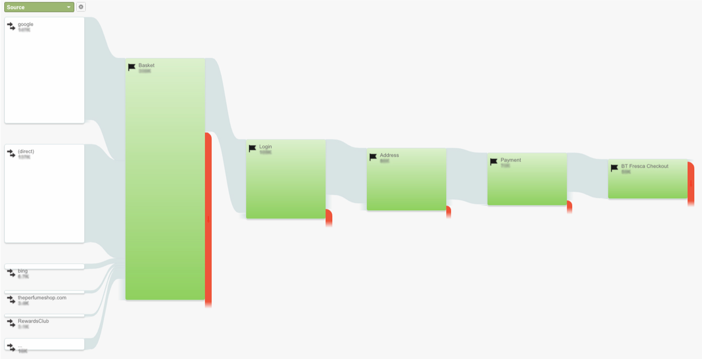
Nice linear checkout process
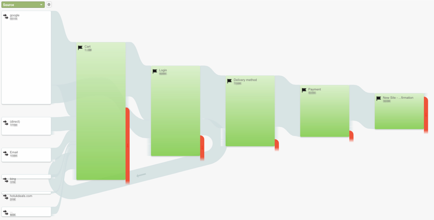
A loop issue is occuring driving users out of checkout funnel
Here you can see the two checkout goal flows between the new website design that went live at the start of 2016 compared with the old design. In the old design you can see that the checkout was a nice linear process with users moving logically through each step and then moving onto the next.
Remote User Testing
As what users say is often very different to what they do and that design doesn’t exist in a vacuum, I decided to understand the checkout from the customer’s perspective through remote user testing. To identify potential pain points during the various checkout steps, I set up ten remote user tests using What Users Do platform assigning key tasks to a panel with similar demographics to that of The Perfume Shop customers. I created a testing script asking users to complete a number of key checkout tasks on both desktop and mobile devices and then analysed the findings.
The way some of the users struggled to complete the tasks was really eye opening, there were simply too many steps in the process and with the pages being so cluttered I found it was causing quite a bit of cognitive friction with some users unsure where to click next. Also astonishingly, it took on average 5mins 30secs for users to complete the process which was too long in comparison with other business units in the group.
User test snippet showing user struggling to move onto next stage due to lack of form field validation
Real Customer Recordings
Having revealed these interesting insights, I wanted to get closer to real Perfume Shop customers to see if these issues were affecting real customers. To do this I set up 100 user recordings in Hotjar at the checkout pages and watched real customers go through the checkout process. Interestingly, the recordings showed customers experiencing the same issues but also revealed some other issues including difficulties adding free samples and overseas customers changing their delivery method.
Real customer recording showing user onsite struggling to add free samples at basket and changing delivery country
Checkout Poll
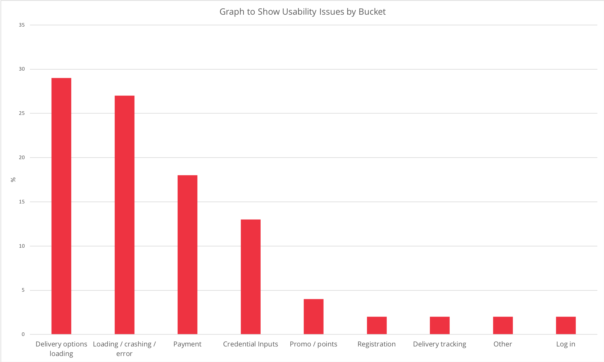
Continuing on the theme of getting close to users, I wanted to validate my findings and understand if there were any other user frustrations so I set up a customer poll. Using Hotjar, I deployed a poll at the end of the user journey that would fire on the order confirmation page asking the customer three questions relating to their checkout experience. Interestingly, the checkout poll confirmed the same usability issues as my previous research also, the overall rating for ease of use was a score of 7 which was considered to be too low by the BU. I then analysed the open ended feedback by reading through all the comments and assigning them to specific usability buckets consisting of 8 usability buckets, this enabled me to prioritise the most significant usability issues and gave me a good framework of what to focus on during the redesign phase. The feedback was consistent across all devices with users biggest gripe being too many steps requiring too much inputs on forms.
All Devices
Desktop
Mobile
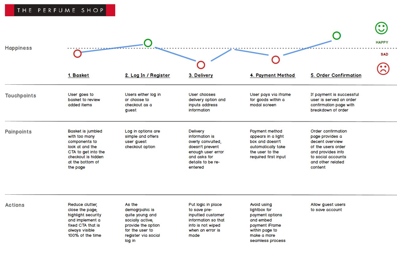
Customer Journey Map
Now that I had solid evidence of existing issues affecting the checkout user journey it was time to present my findings to the Business Unit stakeholders. As I would be reporting my findings to a variety of different stakeholders some of whom had very little technical knowledge I decided a good way to summarise some of my findings would be to map out the entire checkout journey in a customer journey map. This would be a good way to visually demonstrate how customers felt at different stages of the checkout clearly showing user pain points along the way. During my presentation I also included clips from the remote user tests and also clips from the real customer recordings. These three initiatives proved to be massively instrumental in allowing the stakeholders to see first hand issues affecting the user experience and resulted in me receiving buy in to go ahead with a redesign.
Summarised Findings

Key Issue
Click & Scrolling
Lack of click and scrolling on CTA's across multiple pages

Key Issue
Checkout Loop
A persistent checkout loop from login page

Key Issue
Error Prevention
Lack of initiatives on form fields to prevent errors

Key Issue
Form Validation
No form validation on form fields to help user through process

Key Issue
Free Samples
The process of adding free samples was clunky and bug ridden

Key Issue
Form Entry
Unnecessary repetitive form entry particularly at step 2
DESIGN PHASE
User Flows
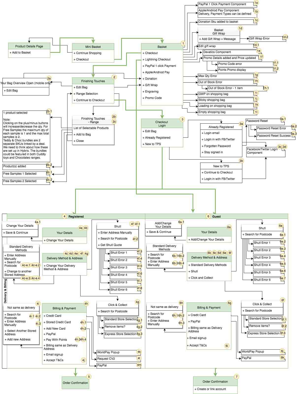
Now that I had a good idea of our approach on the overall design, it was time to nail down the different user journeys. As the site uses a third party component, Devatics, to power a lot of functionality at the checkout I decided it was best to work with the TPS Dev Ops team as they knew the Devatics intricacies which would ensure we wouldn’t miss any customer journeys. The Dev Ops team finalised the following user flows confirming all user journeys included, this was the blueprint for the entire checkout user journey.
Competitor Research
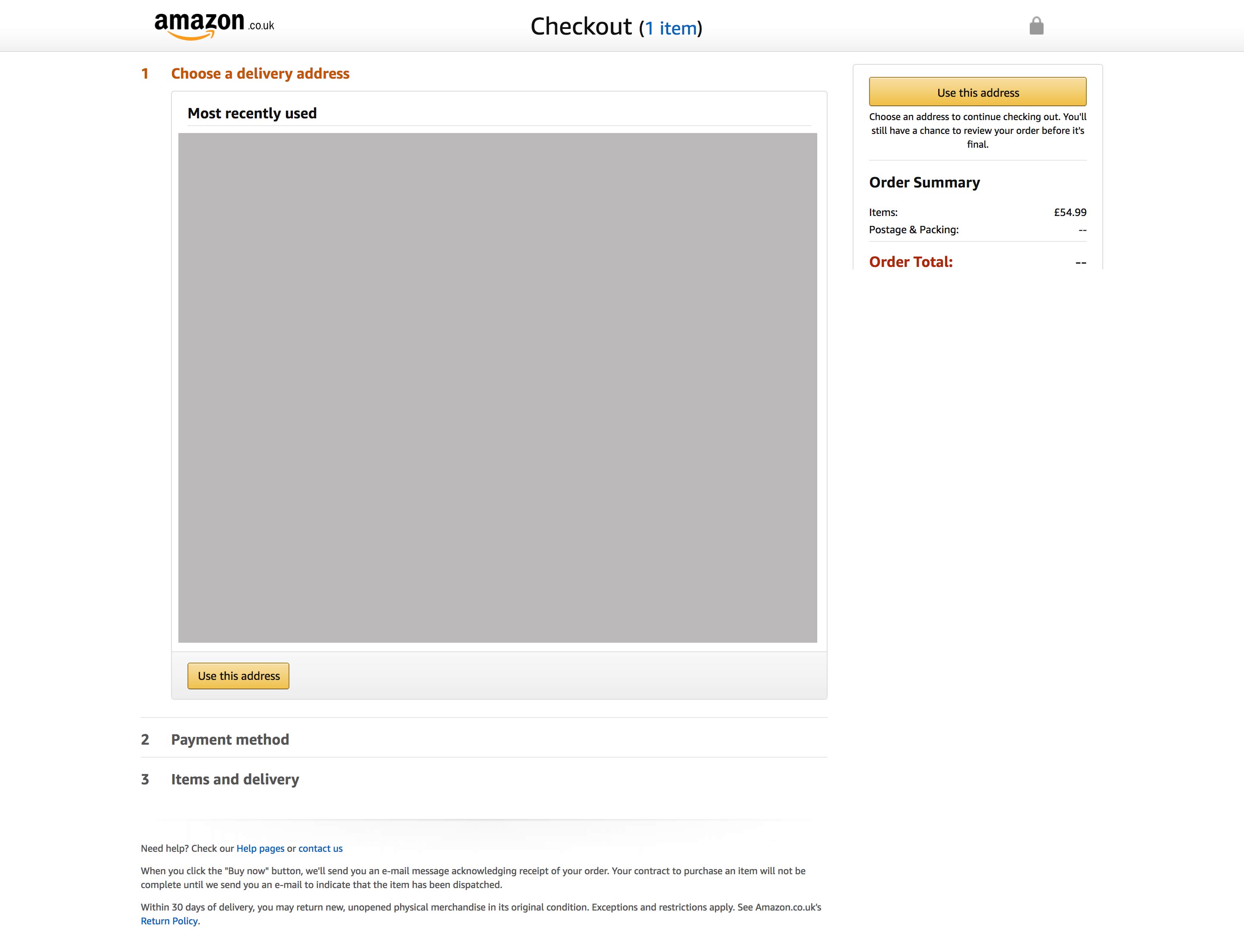
I had some design ideas of how to overcome the existing issues and improve the overall experience but thought I would benefit by gaining more inspiration from retailers with strong ecommerce checkouts so I carried out some competitor research. I looked through a number of ecommerce sites looking particularly at the checkout flow including Fragrance Direct, Debenhams and Amazon. I took some ideas from each site but the concept that stood out most for me was Amazon’s nested checkout that combines multiple steps into one page. I thought that TPS could benefit from a nested design as it would alleviate the the unnecessary additional delivery page and allow users to see a summary of their details at each step in one compact page speeding up the process.
Below is Amazon’s nested one step checkout:
Crazy 8 Sketches
Before I went into the wire framing stage I wanted to ideate some ideas down on paper quickly, so I adopted the Crazy Eight method of sketching 8 different design ideas (30 seconds each) on 8 squares of paper. This allowed me to ideate potential resolutions to the usability issues I uncovered during the research phase quickly and would help form a skeleton for the overall direction for the design.
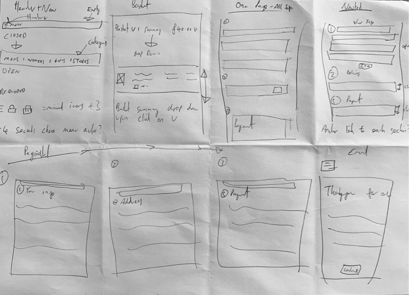
Wireframing
Now that I reached my design concept it was time to pull everything together by creating low-fidelity wireframes for all devices using Balsamiq to iterate through various design options quickly. Working with the design manager Hannah, we used the wireframes to discuss checkout concepts and explore ways to reach the optimum solution. We decided that a nested solution would work well as TPS have an array of different delivery options and by using the technique of progressive disclosure, would hand hold customers through the process reducing conflictive friction.
Sample Desktop Wireframes:


Sample Mobile Wireframes:


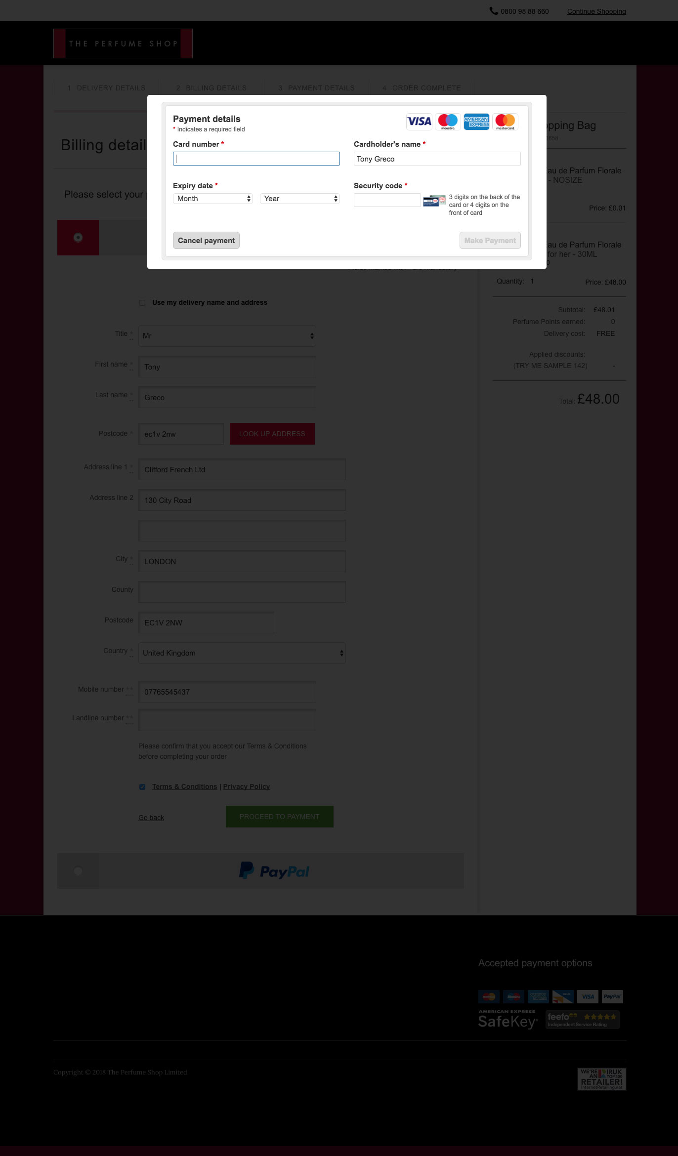
IXD & Prototyping
Now that stakeholders were familiar with the skeleton structure for the checkout pages it was time to bring the wire frames to life by creating a prototype for three main reasons:
- Specify how the pages and components would behave
- User test the designs against users to make design iterations
- Get confirmation and sign off from developers that the intended IXD was possible
Using Axure I started to build a high fidelity prototype taking into account design and UI elements made in sketch. In terms of visual design, this was quite a straightforward process as the other than the header and footer the majority of the checkout is made up of form inputs.
User test snippet of checkout prototype I developed in Axure comparing old checkout vs new design.
User Testing
As I developed the IXD, I regularly conducted remote user tests comparing the new design vs the old using the What Users Do platform to make sure it was improving the following key metrics:
- Effectiveness
- Efficiency
- Satisfaction.
During this iterative design process the user tests help me validate the designs were improving the user experience and were a half way house between this and A/B testing the designs in the live environment. To do this I wrote a user testing script that involved users testing the prototype vs the current checkout. User consensus was that they much preferred the new checkout process something that was backed up by the usability metrics.
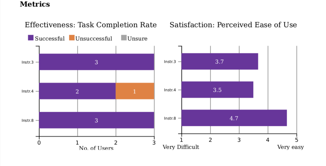
Key:
Instr.4 = Complete old checkout task | Instr.8 = Complete new checkout task (prototype)
Results:
- Effectiveness: User tests metrics above show 1 user failed to complete old checkout where as all users successfully completed new checkout
- Satisfaction: User tests metrics above show perceived ease of use for the old checkout scored 3.5/5 where as the new checkout design scored 4.7/5
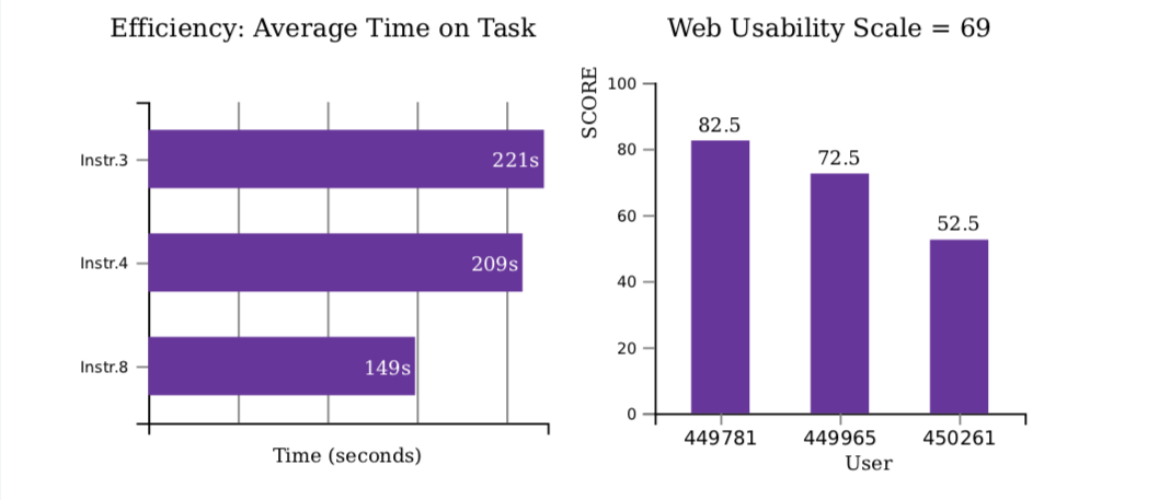
Key:
Instr.4 = Complete old checkout task | Instr.8 = Complete new checkout task (prototype)
Results:
- Efficiency: User tests metrics above show users took on average 209secs to complete the old checkout compared with just 149secs on the new design
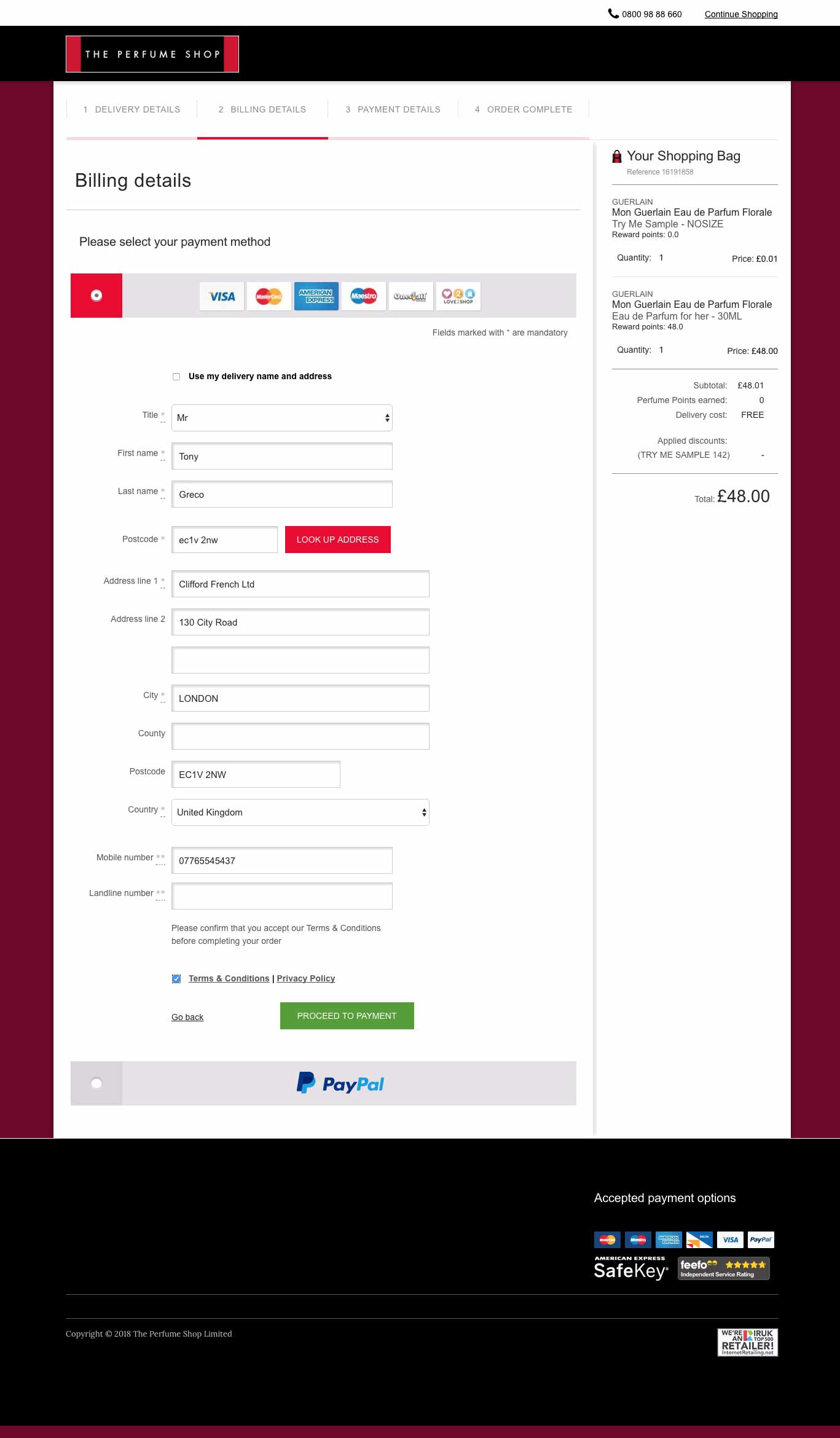
Visual Designs
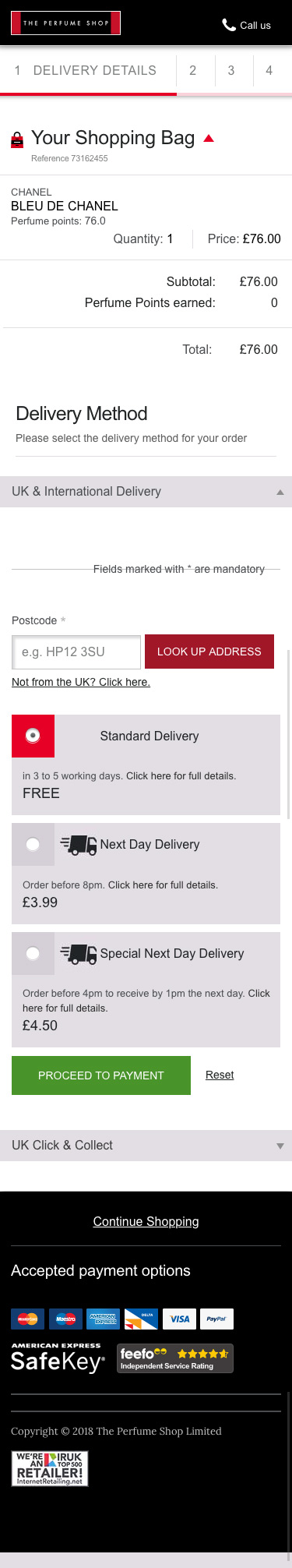
Having benchmarked the designs against the live checkout with users, I was satisfied that I had made vast improvements it was time to move into the visual design phase. The wireframes were passed to the TPS visual design team to complete the visual designs. I worked closely with The visual designer and Business Manager to ensure that the visual designs replicated the wireframes. The visual designs were completed in around four weeks.
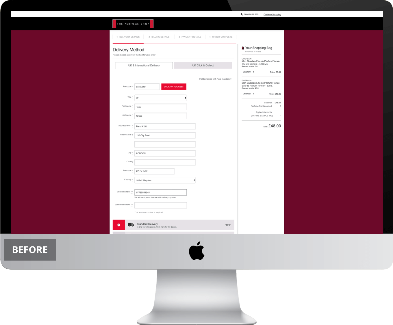
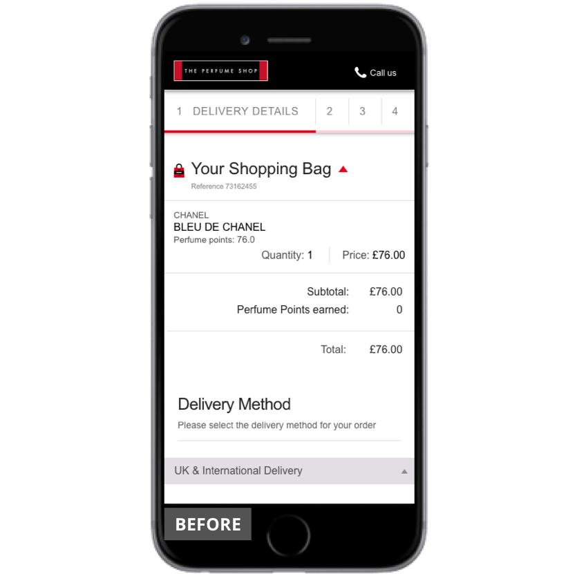
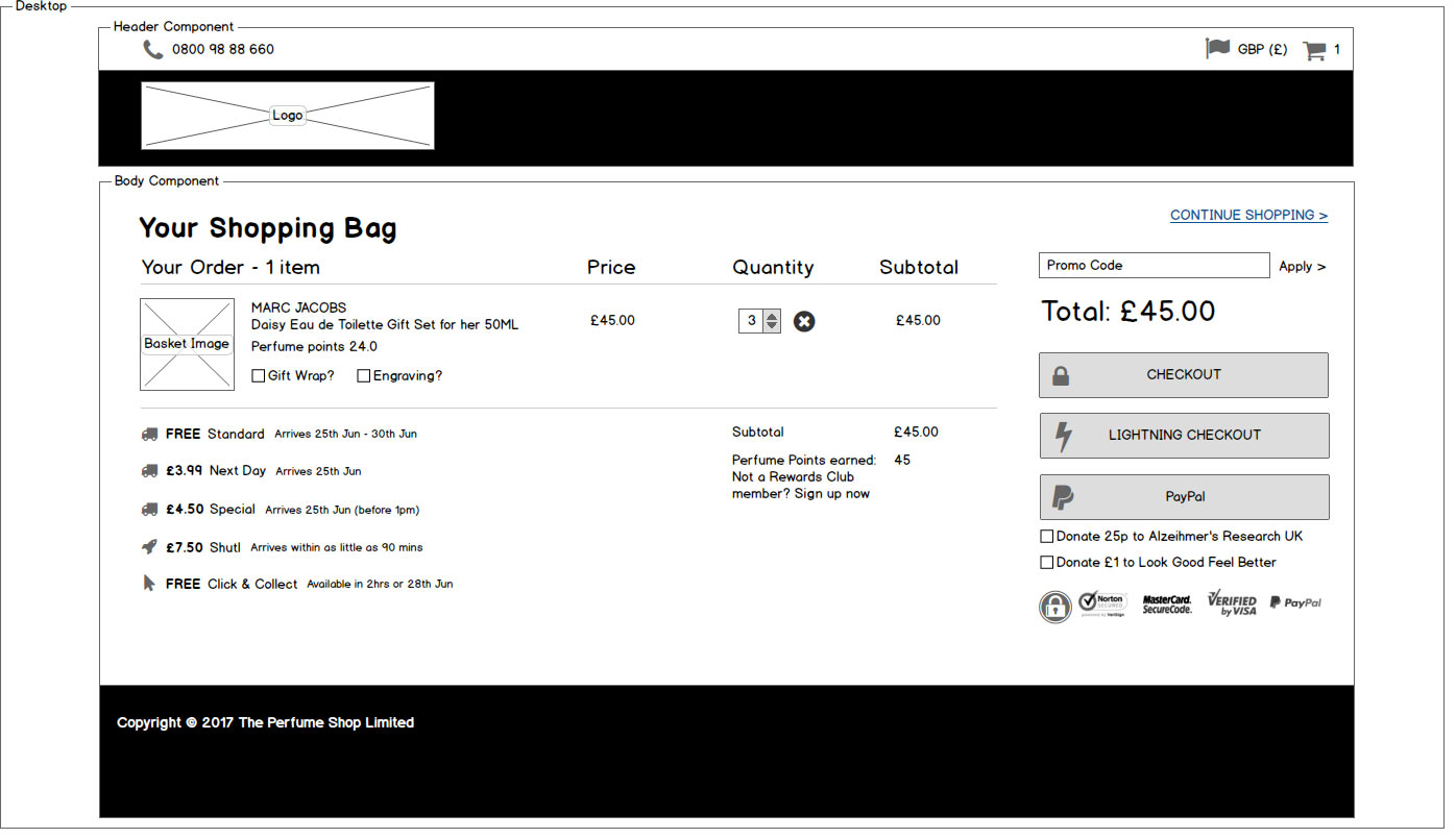
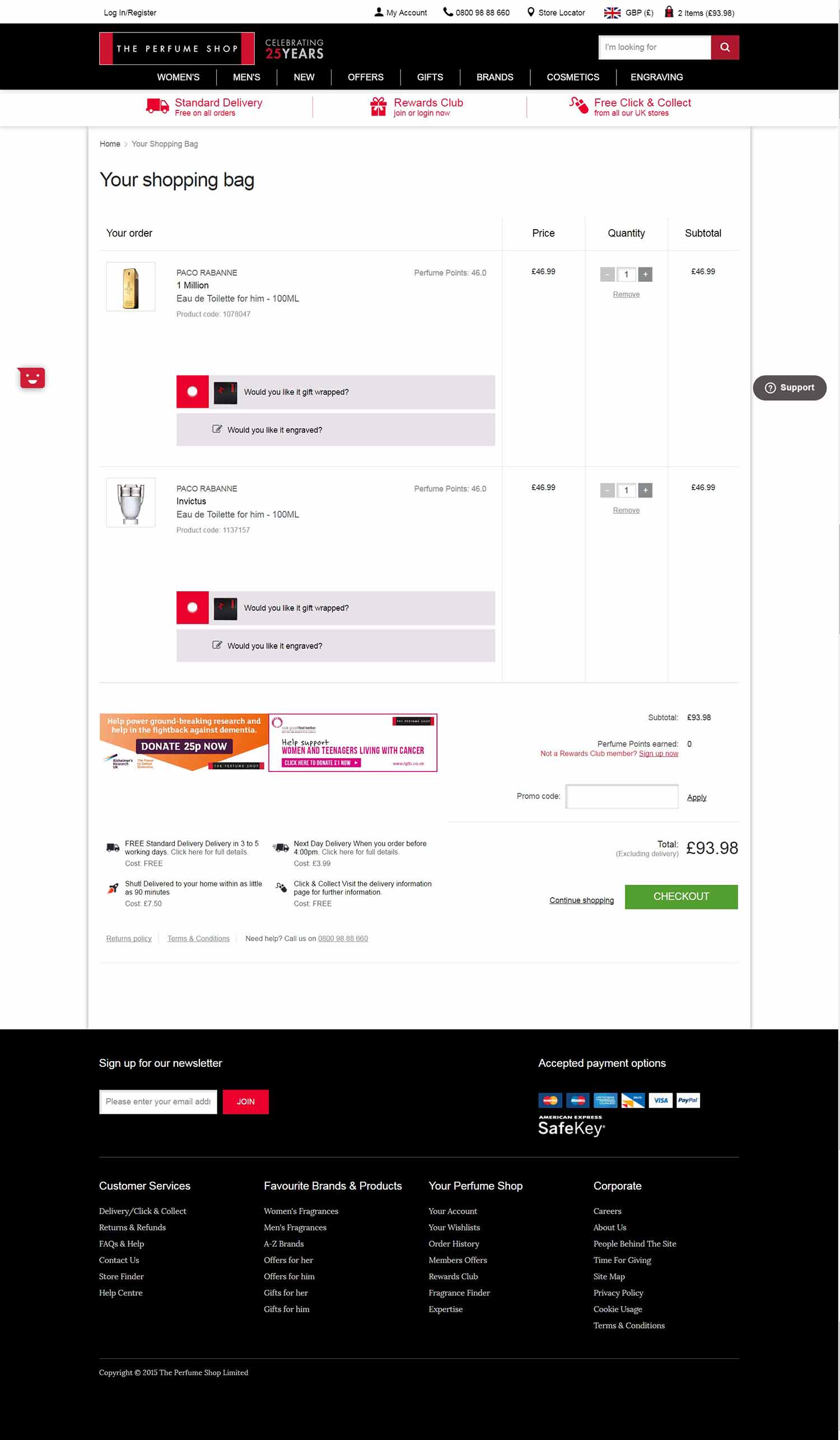
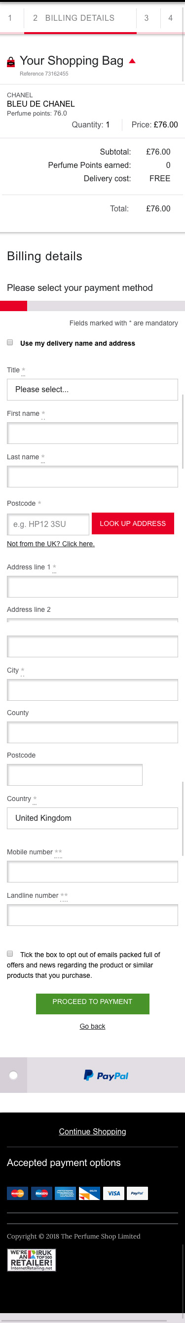
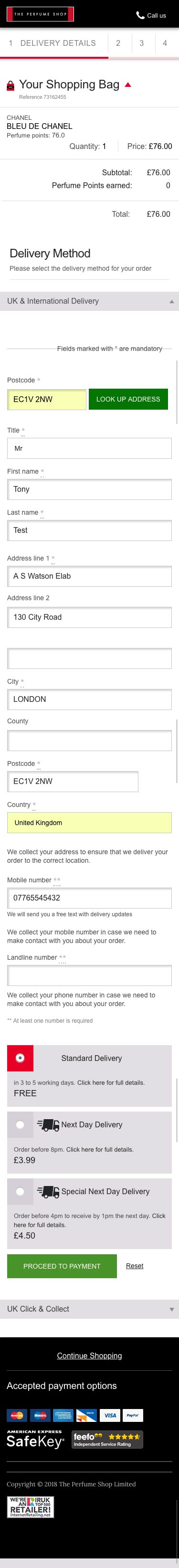
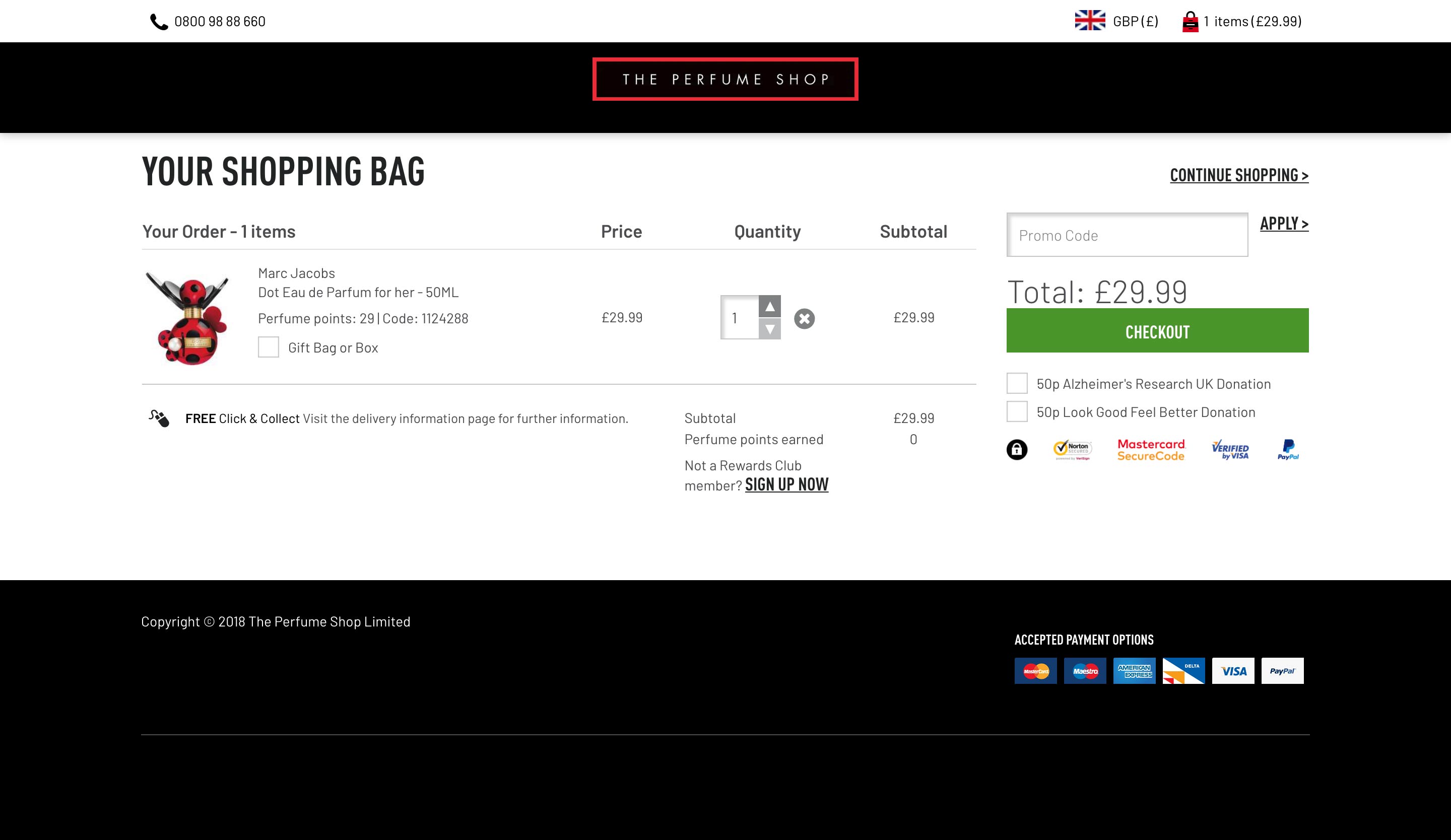
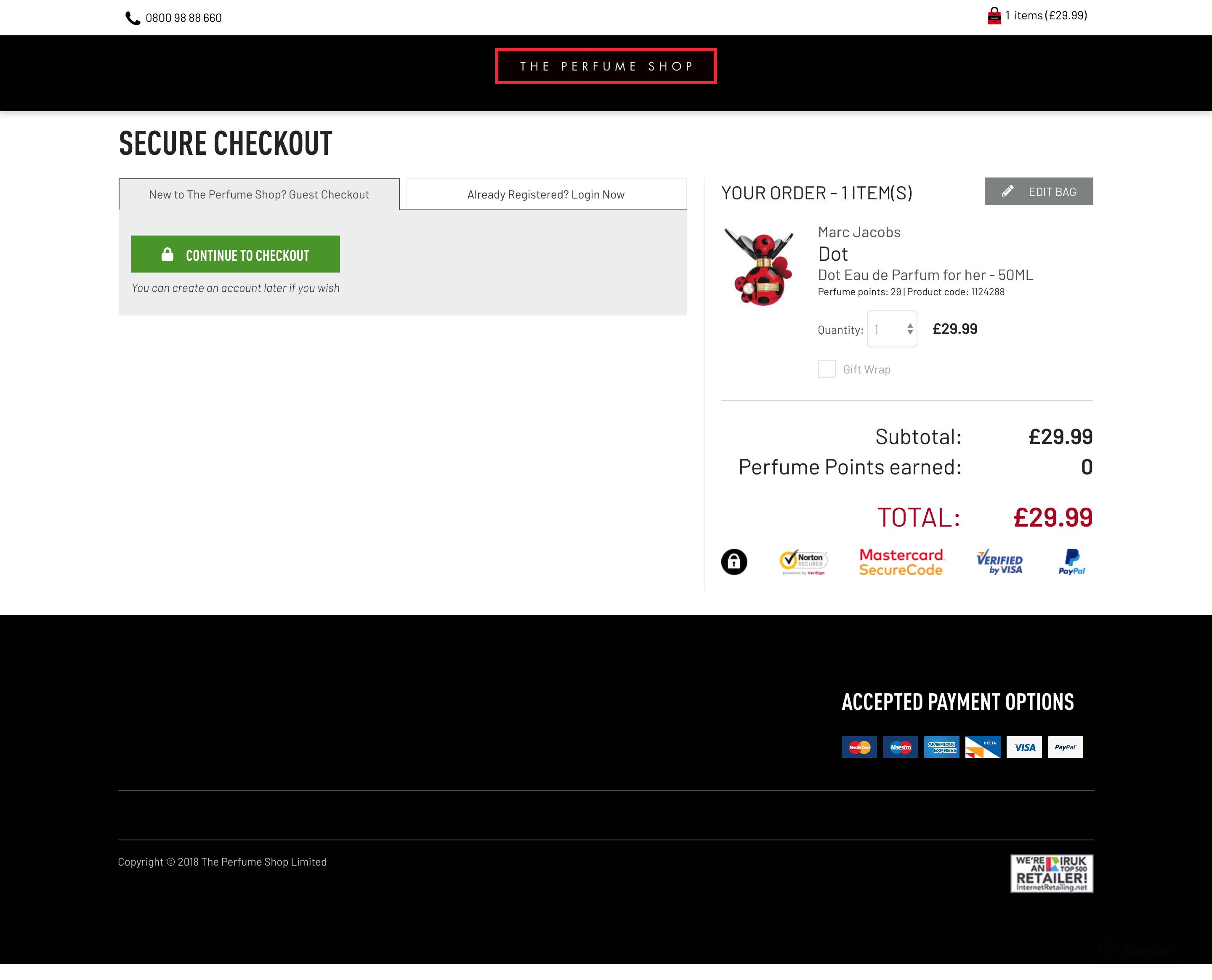
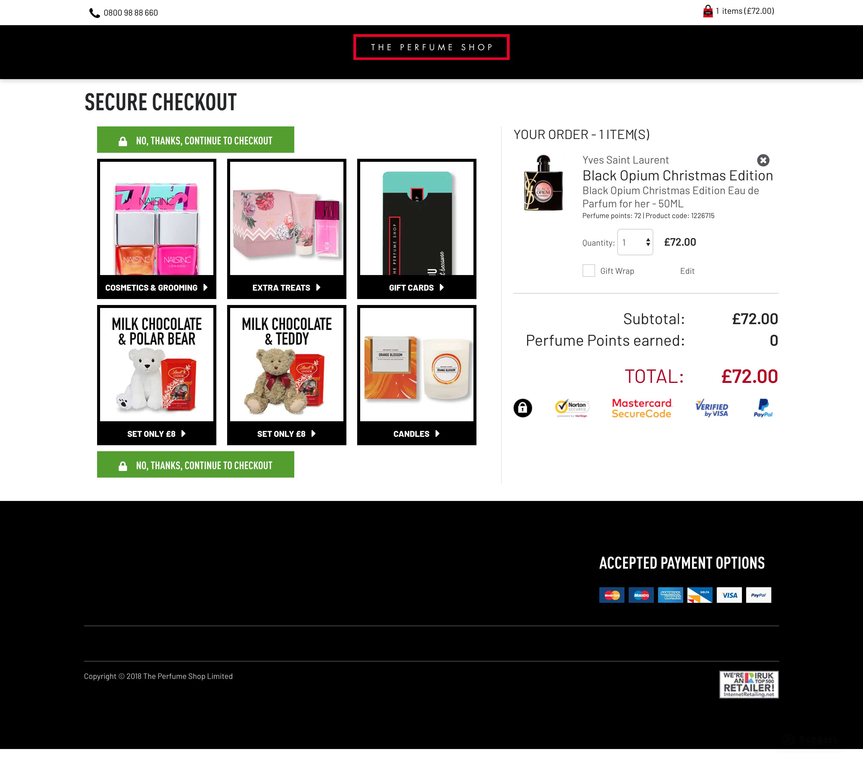
Sample Old Desktop Designs:


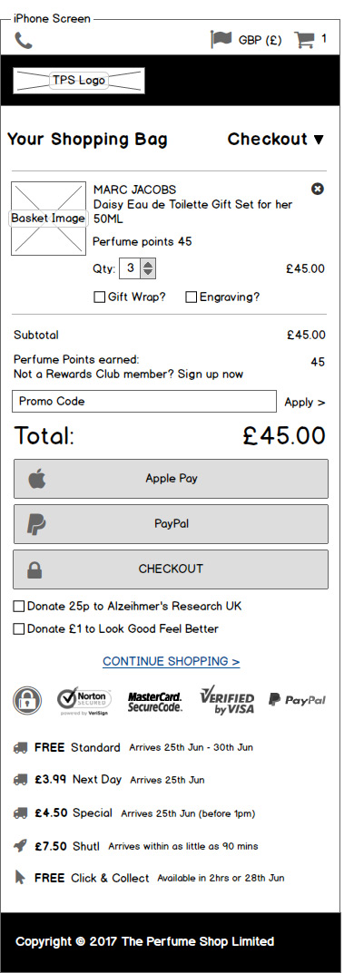
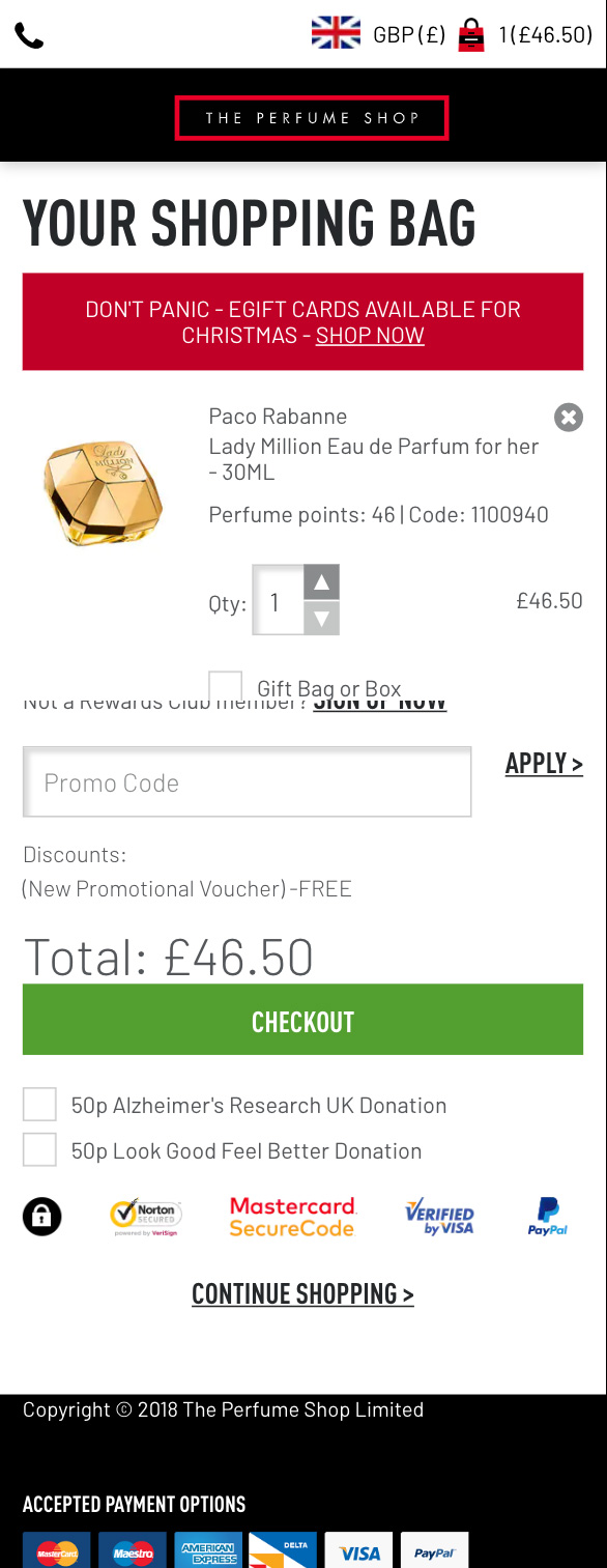
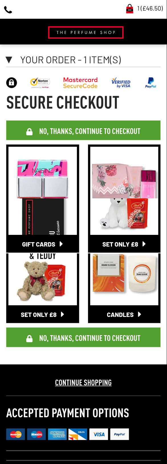
Sample Old Mobile Designs:


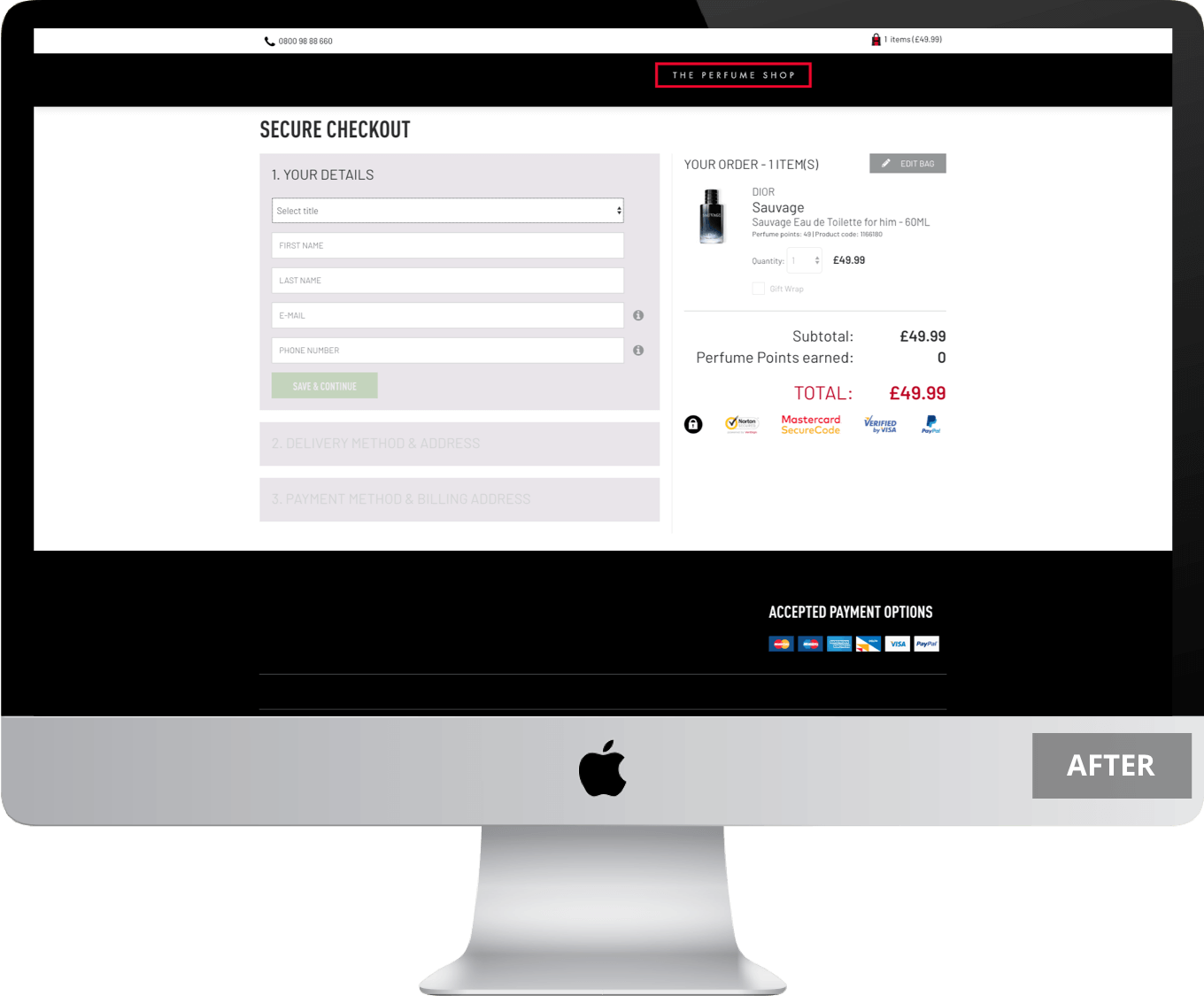
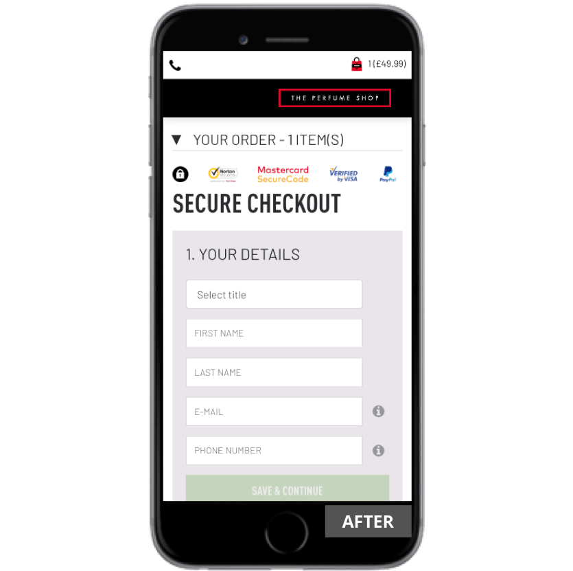
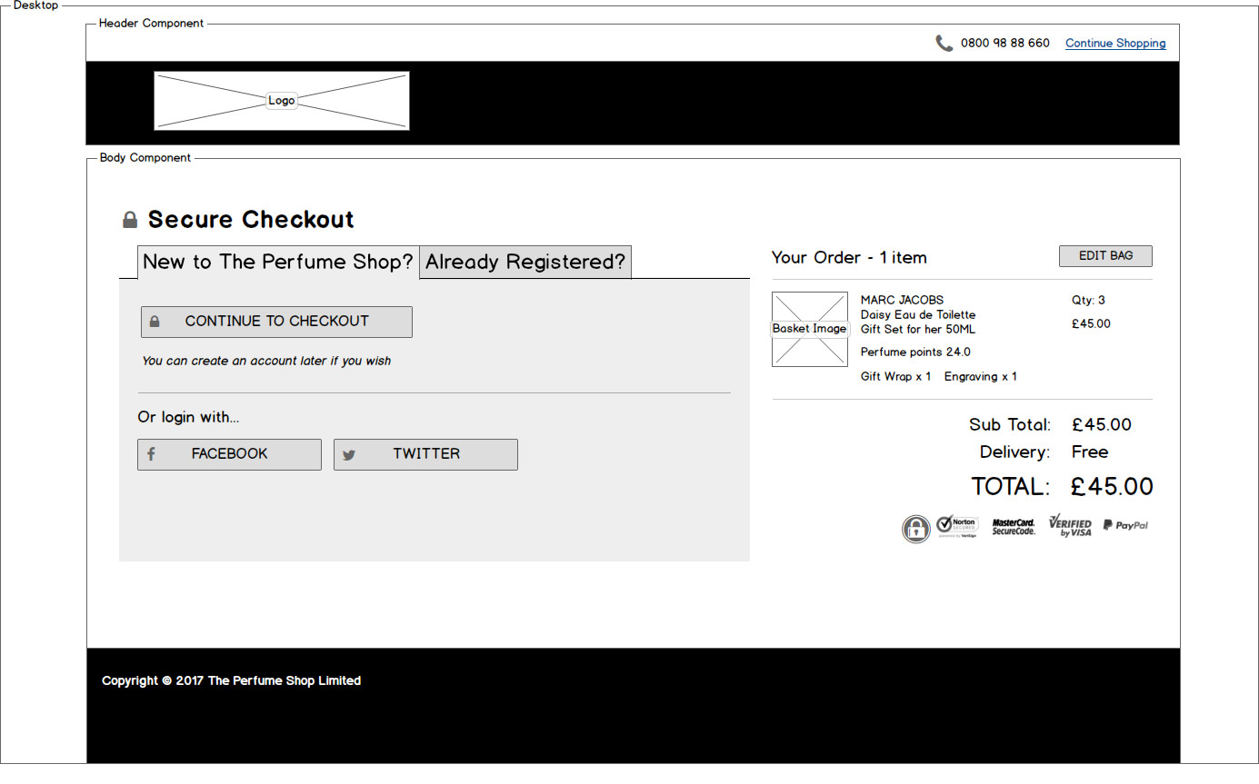
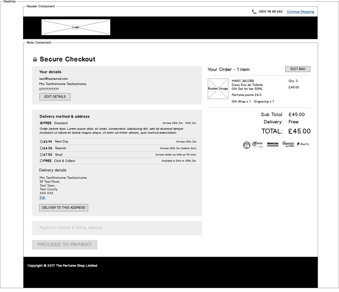
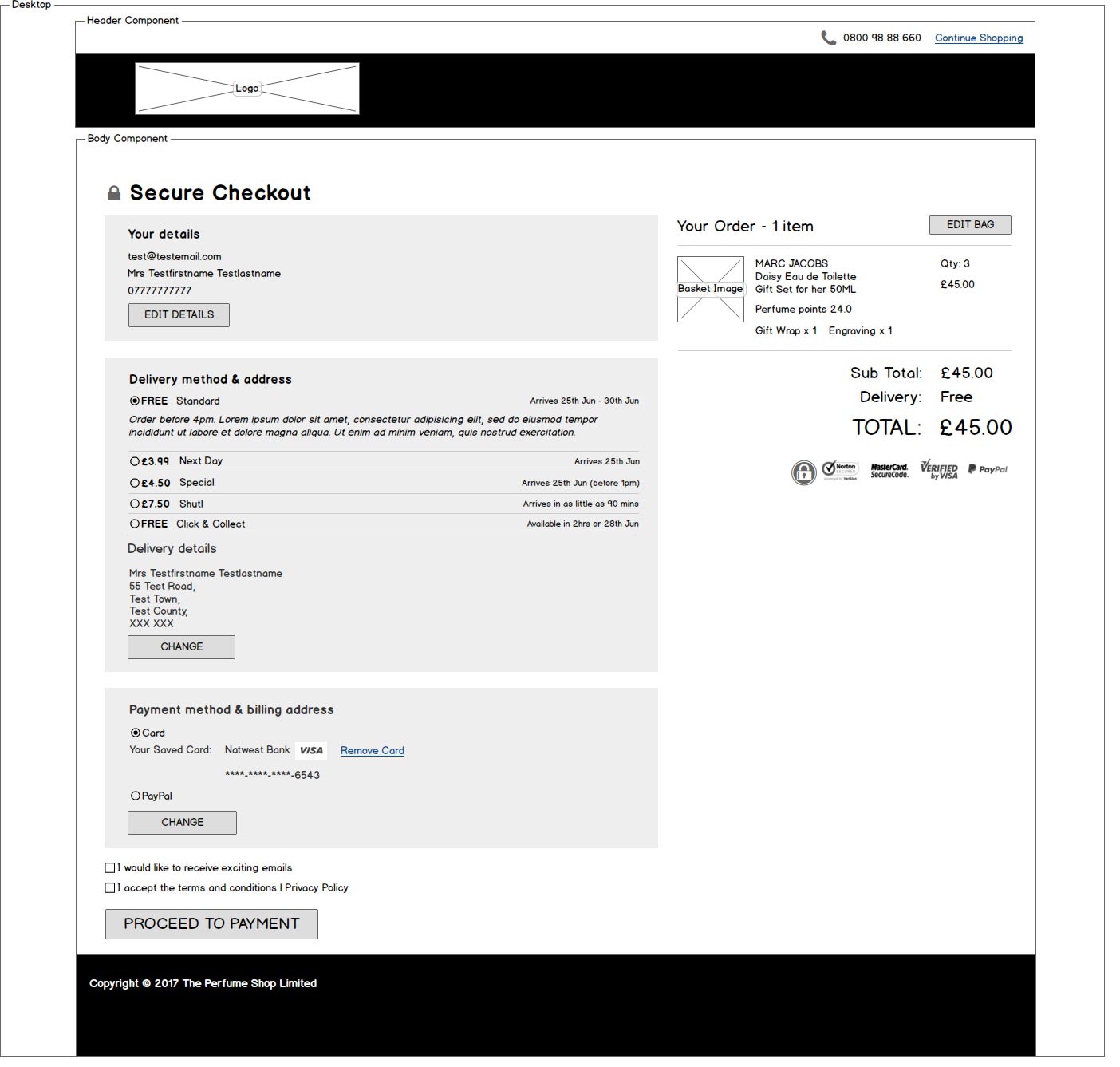
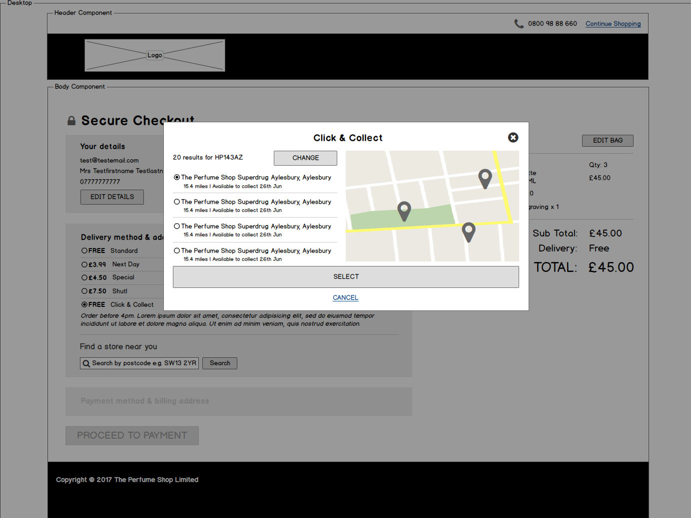
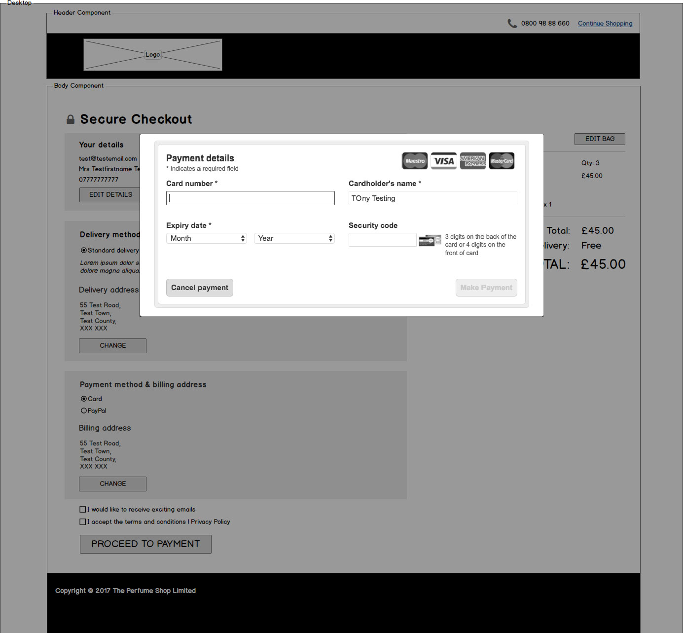
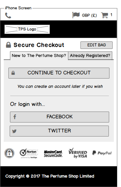
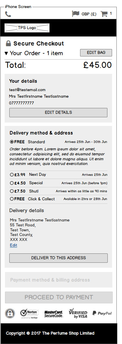
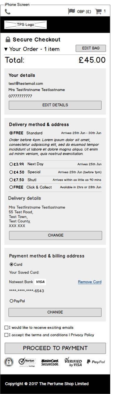
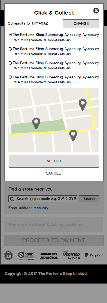
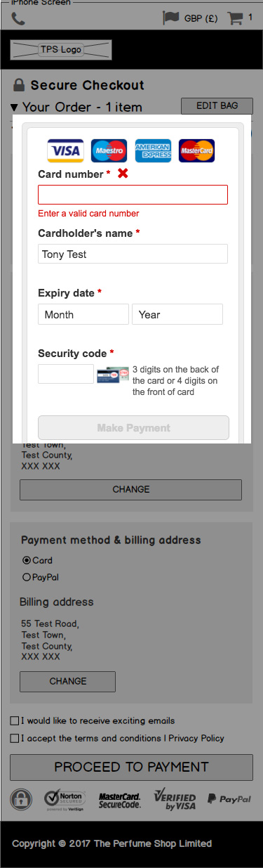
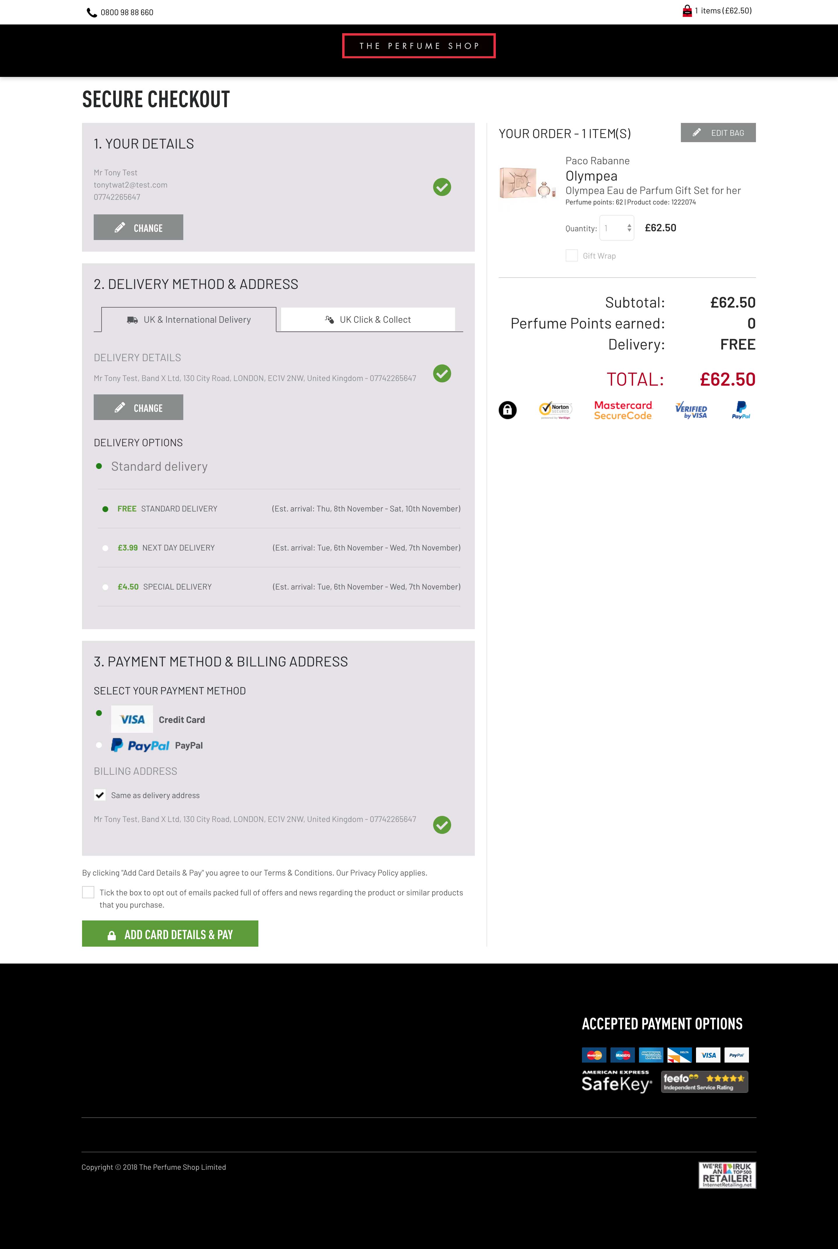
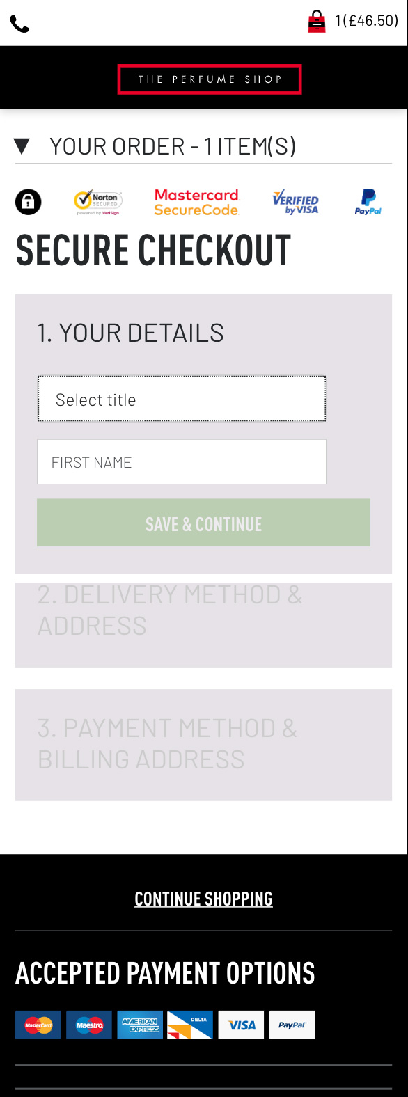
Sample New Desktop Designs:


Sample New Mobile Designs:


Key UX Changes
Mobile Changes
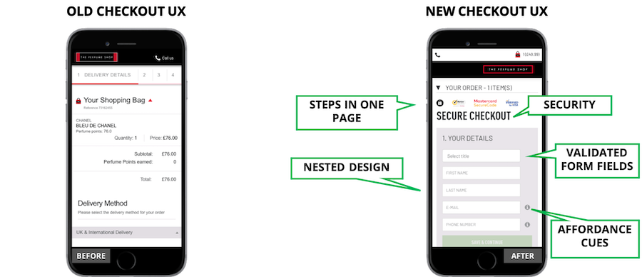
Desktop Changes:
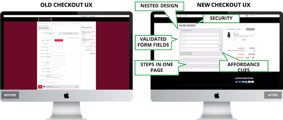
Clicking & Scrolling: Through a clean and tidy nested design, I reduced unnecessary clicking and scrolling throughout the journey by using a technique of progressive disclosure. This meant that the user is only shown relevant fields at each step before moving on to each checkout section (e.g.delivery).
Form Entry & Checkout Loop: The nested design also addressed the form entry and checkout loop issues. By presenting all info on one page removed the unnecessary steps such as billing address in the old checkout and curbed the loop issue as there were no other pages in the journey the user needed to visit.
Form Validation & Error Prevention : I introduced form validation on every form entry which significantly increased error prevention as the user knew what they had entered was correct before submitting the form. In addition I introduced affordance cues in the form of roundels that explained to the user what was required on the relevant forms – this made the process very sleek moving between each nested section.
Adding Free Samples : I created a custom page powered by Hybris at the start of the checkout journey (as shown in prototype testing video) that solved the clunky free sample issue dedicated to adding free samples.
Security: I made an effort to highlight security of the page by having “secure” appear in checkout tittle, padlock symbols and showing SSL certs.
DEVELOPMENT PHASE
Pre Go Live
Our development team worked for a period of around four months developing the new checkout on our development environment then to UAT. Once the new designs were on UAT it was time for testing to make sure that the checkout behaved in the intended way. This proved to be quite an exhaustive process as we encountered a large number of unexpected bugs particular relating to third party extensions such as social login, PSP’s etc. As the bugs related to intricate parts of the site the internal TPS Dev Ops team lead the UAT phase to iron out the bugs before go live. This process involved the bugs to be categorised into priority and severity order so the bugs most detrimental to the UX could be fixed first. This UAT bug fix phase lasted for a period of around a month and delayed the project go live date considerably. Regardless of the project being behind schedule this stage was imperative to ensure the checkout released onto production was as intended and gave TPS customers the best possible checkout experience.
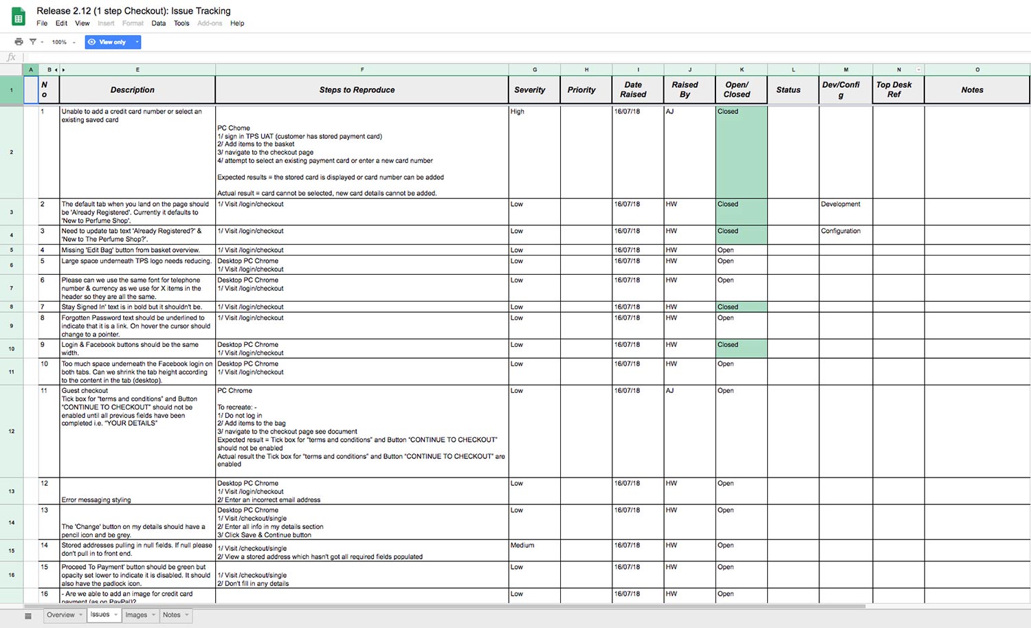
Screenshot of checkout bug log worked on with developers.
Go Live
With the majority of bugs fixed by the dev & QA teams, TPS scheduled a golive date that all stakeholders worked towards. However, even though all high and mid priority bugs were fixed prior to go live there were some existing low priority bugs that would be fixed post go live. The new checkout went live on The Perfume Shop live site 11/10/18.
RESULTS & LEARNINGS
Post Go Live Bug Fixes
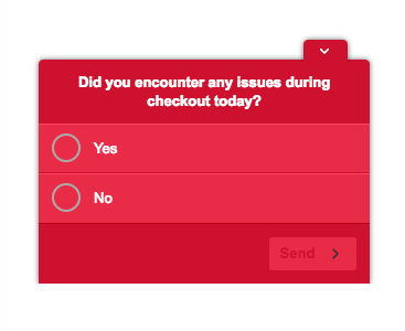
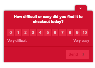
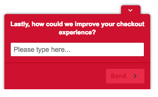
With some minor bugs present post go live it was very important I analysed the site on a daily basis to feedback to TPS usability issues – I did this via a checkout poll.
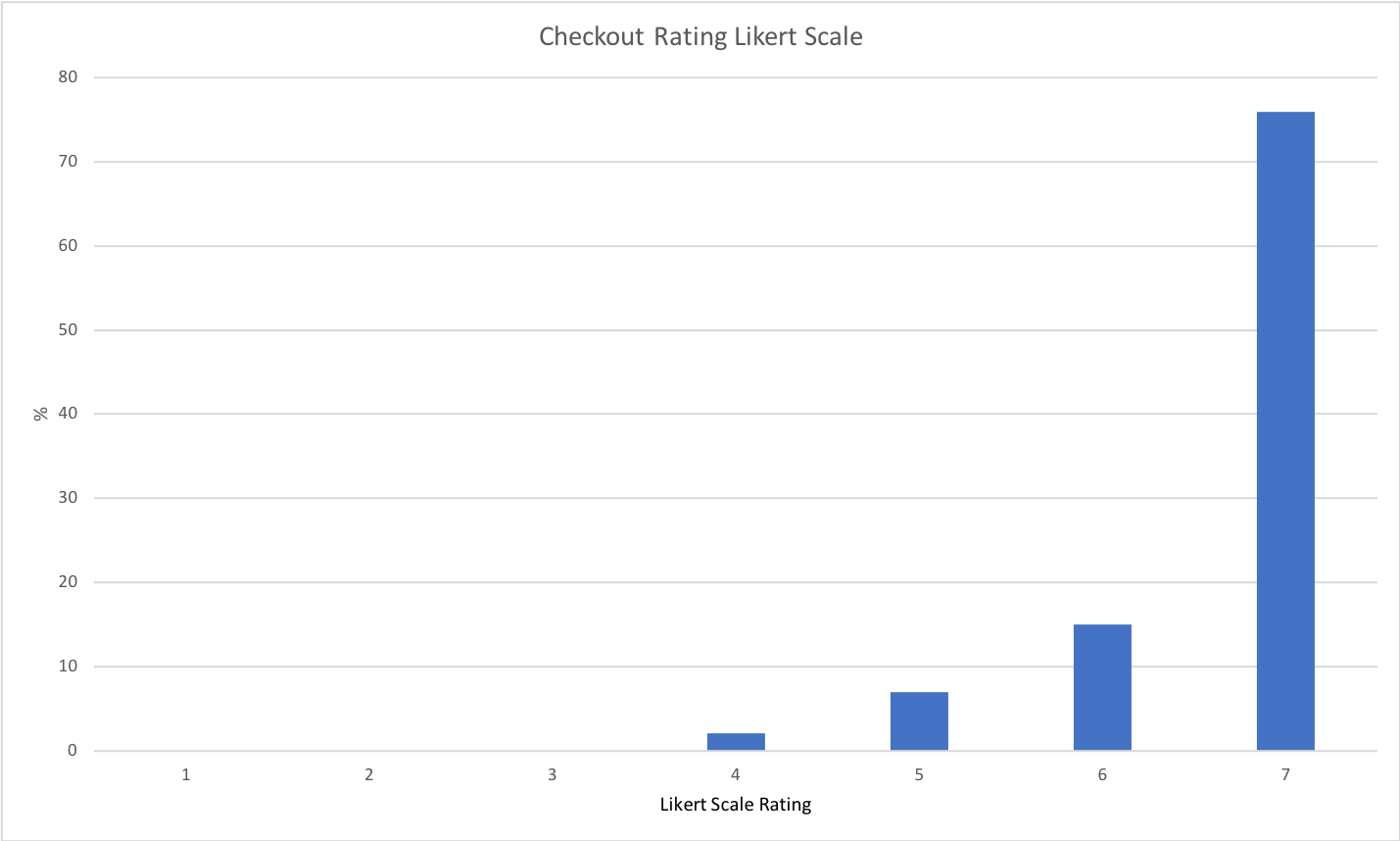
Using Hotjar, I conducted a user checkout poll that fired at the end of the checkout journey on the order confirmation page. Using question logic enabled me to assess user journeys for users that did incur issues and those that didn’t. I did this by asking a very simple radio button question- “Did you experience issues during checkout today”? Users that answered “no” were then served a Likert scale question asking them to rate the usability of the checkout. Users that answered “yes” were then served an open text field to elaborate on what the issue they experienced was. I then exported the results into excel on a daily basis and did some granular analysis by assigning usability buckets to each response meaning I could clearly identify the biggest usability issues. I would then work with the development teams to highlight these issues to make fixes. All bugs were fixed within two weeks.
Results
Once the short period of bug fixing in the live environment was complete, I recorded and reported the checkout KPI metrics.
8
Checkout Conversion Rate %
7
Overall User Rating (Likert scale 1-7)
41
Time on Task Reduction
Live A/B Testing
Even with the good results, we didn’t want to rest on our laurels and continued with our mantra of continuous improvement and carried out some A/B testing on the new checkout to further improve the customer checkout experience.
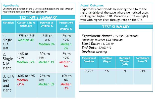
Screenshot of A/B testing reporting deck of checkout test done taken from deck done in conjunction with the A/B Testing community I ran.
Learnings
Overall this was an exciting project and I’m proud to have delivered such impactful changes to such an integral part of the user journey for The Perfume Shop. During the user research process, I was genuinely surprised to see how many users got frustrated at step two of the checkout that required users to enter their details for a second time that seemed to be unnecessary. This frustration was backed up in my checkout funnel analysis and we overcame this by removing this step all together and handholding users through each step seamless by using the technique of progressive disclosure. I also liked my approach of not resting on my laurels by A/B testing the changes post go live allowing me to make constant tweaks based on the results with real customers.
However, like most UX projects it came with many challenges, but the most difficult piece I found was on the development side. As this was a large piece of work, making sure the checkout was developed as intended was challenging. This was also made more difficult by the fact that the developers working on this were based in both Milan and Kyiv. Factors such as language barriers and time difference meant I had to be extra vigilant in explaining methodologies and interaction design. Thankfully we were able to get everyone on Slack and Zoom, which made back-and-forth changes much more fluid.