Debenhams is the UK’s eighth largest retail site and I was brought in to consult their digital team inline with their digital transformation strategy. I was assigned to work on a checkout project introducing a new payment iFrame that enables the business to reach PCI compliance. My role was to carry out the early phase UX discovery work and redesign the user flow & interface, in doing so I collaborated with an array of stakeholders including UI team, Product Owners, Developers and the Senior Management Team.

PROJECT SUMMARY
| Metadata | Metadata Input |
| Project Name | E-commerce Secure Payments |
| Project Tagline | Redesign checkout user flow and interface to accommodate iFrame to reach PCI Compliance. |
| Project Summary | Conduct the discovery phase UX research and redesign a new checkout interface. |
| Client Name | Debenhams |
| Project Timeframe | 01/12/2019 – 09/04/2020 |
| My Major Tasks & Responsibilities | Journey analysis, competitor benchmarking, analytics review, wireframing, prototyping, user testing |
| Platforms | Webapp |
| Design Tools | Adobe XD, UserZoom, InVision, Axure, Sketch |
| Key Performance Metrics | Time on task, checkout completion rate |
| Team Members & Collaborators | UX Designer: Phil (me), UI Lead: Roi, UI Designer: Cristy, Product Owner: Patrick, Technical Lead: Rohit |
| Link to FInal Project | www.debenhams.com/checkout/payment |
DISCOVERY
Project Kick Off
To kick off the project, it was important to get a select group of stakeholders together to align everybody on the project and get a formal briefing from the Product Owner, so I called a meeting with key stakeholders. This involved a nominated member from each of the following teams- UI, Product, Dev, BA and Digital. In the meeting we discussed the project requirements in more detail and assigned specific roles and responsibilities per team member.
")
Phil (Me)
Senior UX Designer
Responsible for the end to end UX of the project

Ro
Senior UI Designer
Responsible for the end UI design

Patrick
Product Owner
Manage and be responsible for the overall project

Mark
Business Analyst
Responsible for defining business requirements

Robin
Developer
Responsible for development

Rohit
Head of Dev
Responsible for overall tech delivery
Project Objectives
Following the project kick off meeting it became clear that there were two main objectives of the project:
Understanding Promo by Tender Type
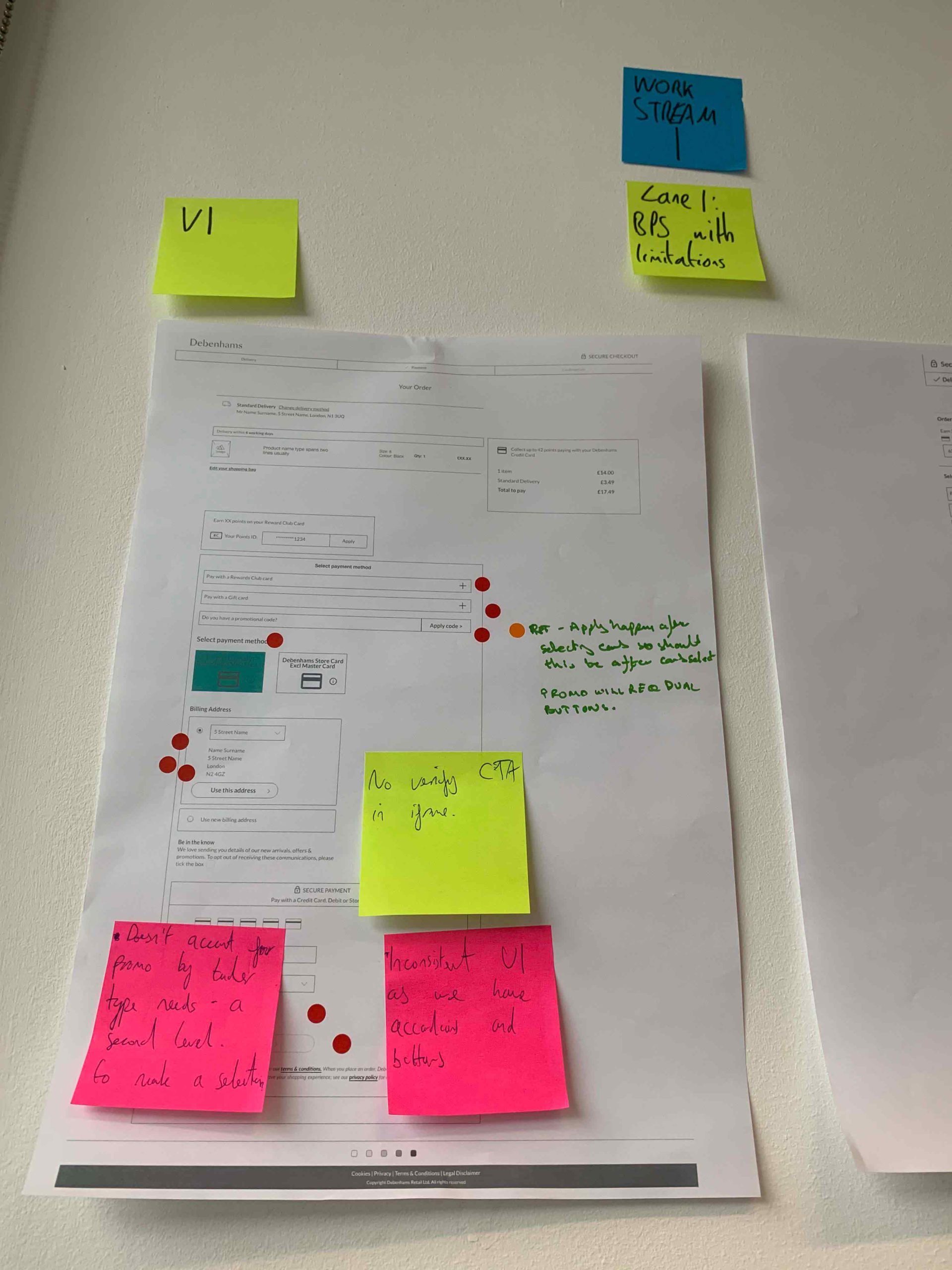
It became clear to me that one of the biggest UX challenges was going to be how I handled promo by tender type in the design considering that the user flow was likely going to have to be altered. To get familiar with how the mechanism worked I rigorously tested the existing experience and also found some old documentation on a previous experience that aimed to tackle the same challenges.
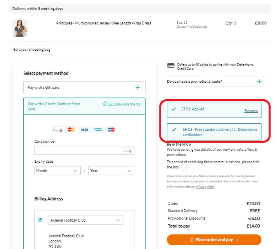
Current UX: Promo by tender type is applied dynamically as user enters in credit card info
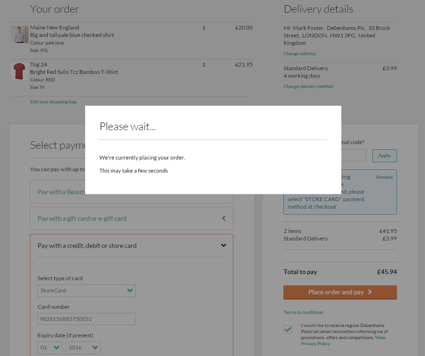
Old UX: Design shows how promo by tender type is handled post transaction
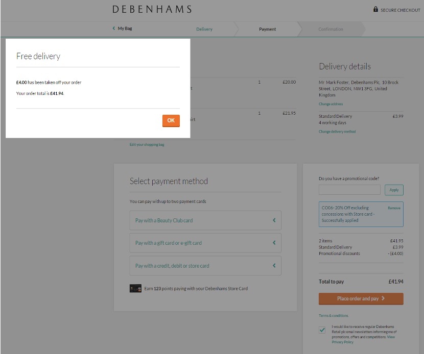
Old UX: Once “pay” CTA is clicked it tells user that promo has been deducted – this makes for a clunky checkout experience
iFrame Constraints
During the discovery phase of the project, I conducted multiple meetings between key internal stakeholders and the new PSP to aid our understanding of the complicated constraints of the new iFrame. Amongst many requirements there were two stand out constraints that would be at the forefront of my UX thinking throughout the project.

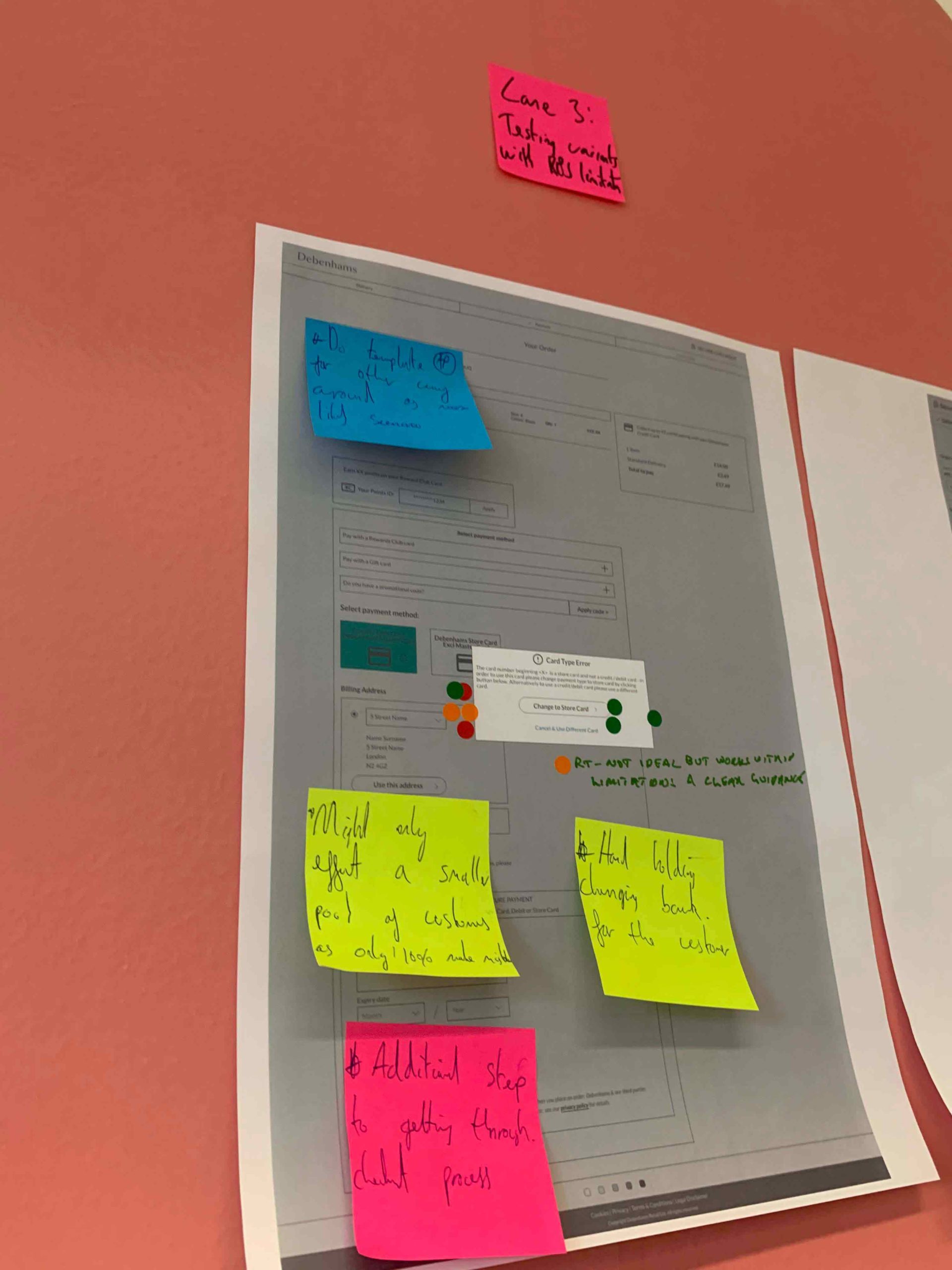
Constraint 1
Processing Legacy Cards
Due to the nature of some legacy Debenhams store cards not having things like expiry date, meant the iFrame wouldn't be able to process all Debenhams cards. This meant that there would be likely two separate payment lanes based on a customer selection - one for regular credit cards and one for legacy Debenhams cards.

Contraint 2
Error Messaging
Due to complex technical configuration at the PSP end, meant that we were unable to serve custom error messaging specially if a failed payment related to a wrong card selection being made e.g. A Debenhams credit card being inputted into the wrong payment lane.
Competitor Benchmarking
Once I had a decent understanding of how the existing checkout worked I wanted to have a look at how some competitors using the same PSP implemented a similar mechanism at checkout. I did some testing on both River Island and Marks and Spencer to get ideas on how they handled the same.
Risk Analysis
Now that I understood how the checkout worked, I realised that the project carried huge business risks if we were to get things wrong mainly because I was touching the most crucial part of the website and the sheer volume of payments that went through it. Therefore I wanted to asses the risk in numerical / financial terms that I could communicate to senior management to ensure all bases were covered. Working with the analytics team, we made a request for them to analyse the number of customers that used regular credit / debit card, Debenhams MasterCard and PLCC cards. Top line, the picture looked liked this:
N.B For client confidentially I can’t include the actual monetary figures.
25
Debenhams Credit Cards make up total online revenue
39
Of these use a non-Mastercard Debenhams store cards
61
Use a Debenhams Mastercard
300
Debenhams took 300+ different payment cards, combinations & tender types over a one year period
These figures spoke volumes about the importance of the project and how far reaching the implications actually were. With a ¼ of all purchases being made on a Debenhams credit cards alone, I realised how important the “Promo by Tender Type” mechanism was and how many customers it applied to during the checkout phase meaning it was imperative the new flow didn’t confuse new and existing customers.
Summarised UX Challenges
Having gotten under the skin of the existing checkout and understanding the requirements & implications of implementing a new iFrame to handle PCI compliance, it became clear that along with the two main objectives there were six key UX challenges I would have to address during the design phase.

Challenge 1
Single Step
Possibility of adding an additional step to the new design would increase cognitive load during checkout which would be risky
Challenge 2
Card Types
There were many different card types used by customers - it would be difficult to communicate the differences in card types visually as there are so many all with different designs

Challenge 3
Reliant on User
With a selection type design, we’re relying on users to select the correct card type as they go through the checkout process

Challenge 4
Wrong Route
Potential issue of customer selecting the wrong route and not being able to pay

Challenge 5
Error Text
IFrame does not allow us to serve bespoke error messaging therefore we would be unable to tell customers why their payment has failed e.g. Wrong card type

Challenge 6
Saved Cards
“Tokenised” cards added to complexity to UI as customers would be able to select from different lists
DESIGN PHASE
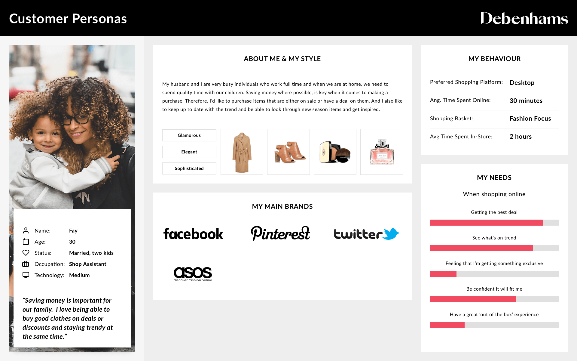
Persona
As I began to understand the project during the discovery phase, it quickly became evident to me that I was going to have to conduct some user testing on real life Debenhams customers later in the design phase because of the complex PBTT mechanism. As a result I wanted to focus on a primary persona that would frame my designs, that would be the customer type I would test my designs on later. Taking into account the customer types I discovered with the analytics team during the risk analysis, I focused on a personal type that made up 39% of the overall transactions. Although the lion share of the persona was made up of analytical / marketing data, it was relevant as these were the customers I would reach out to via CRM later to recruit for testing.
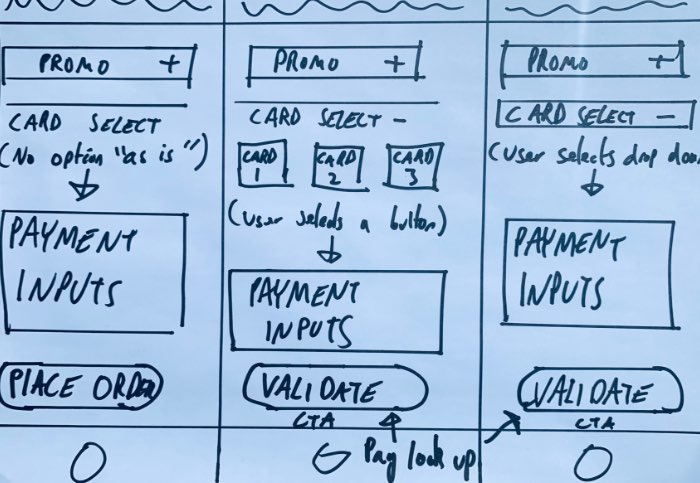
Sketches
To begin the ideation phase, I spent some time ideating some potential solutions starting with some sketches to help me quickly iterate ideas and provide rapid visuals as a starting point. My sketches included payment selections via button and drop down and considered a “verify CTA” to help deal with specific customer types.
Wireframes
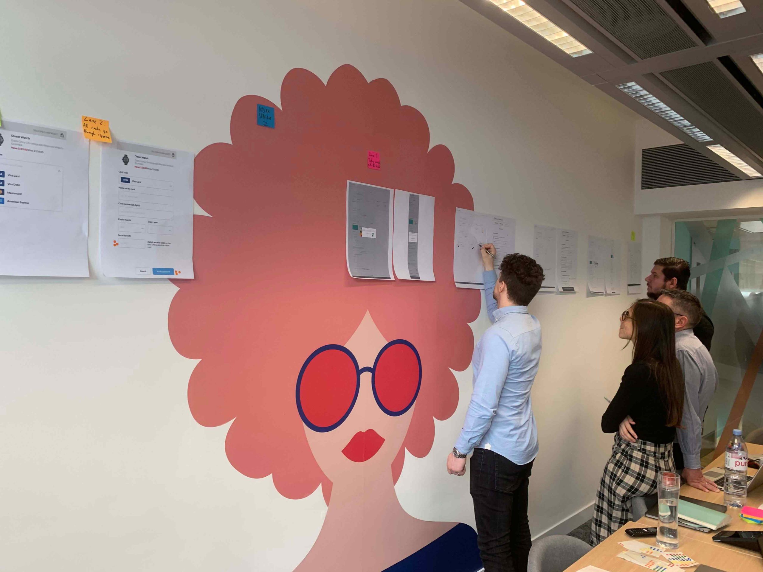
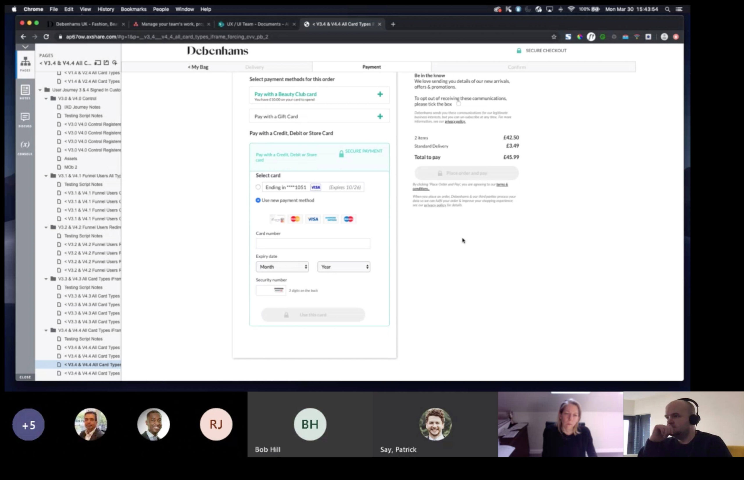
It was my intention to present the design variant to key stakeholders so I could explain my rationale for each and how they addressed the design challenges. Rather than use the raw sketches, I wanted to produce more accurate wireframes that I could blow up to a large scale and use in workshops and presentations. Using Adobe XD I created some low fidelity wireframes creating the variants across all devices. I then used the wireframes in a variety of workshops and presentations that proved to be really handy in explaining rationales to stakeholders across the business in particular senior executives.


Proposed Solutions
Following the sketches and wireframes, I was now confident that I had ideated four genuine solutions to solve the main UX challenges that I could start presenting to stakeholders.

Solution 1
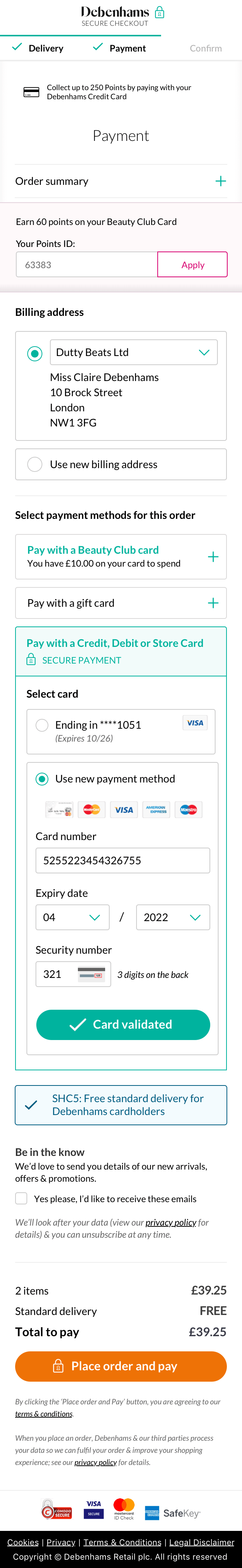
"Verify Card" CTA
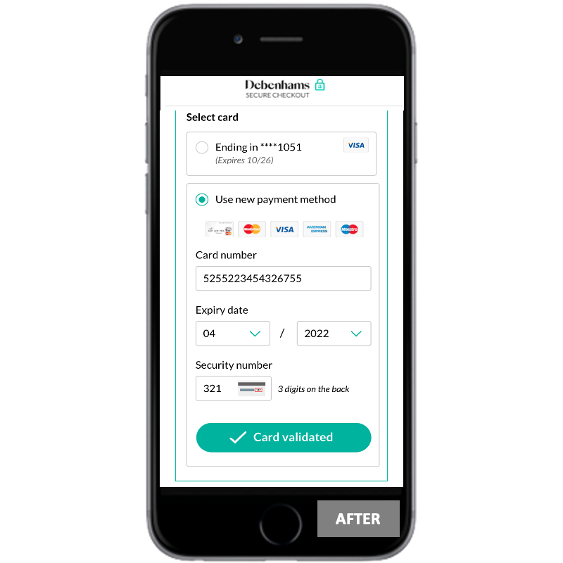
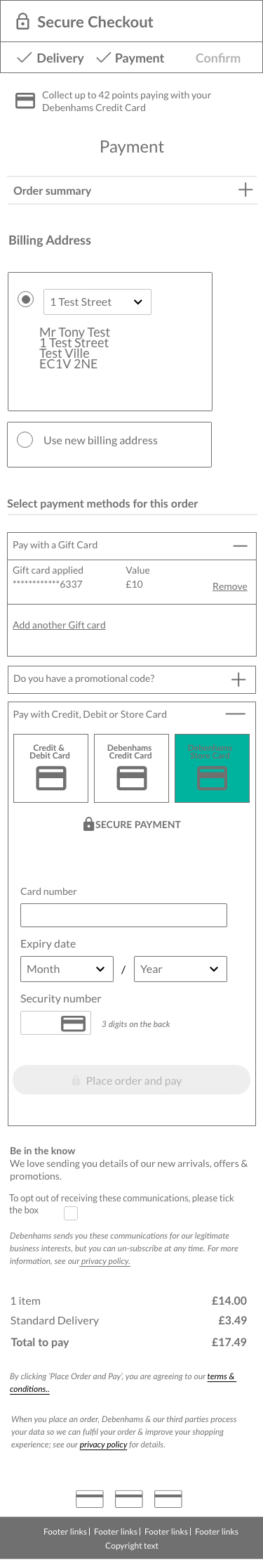
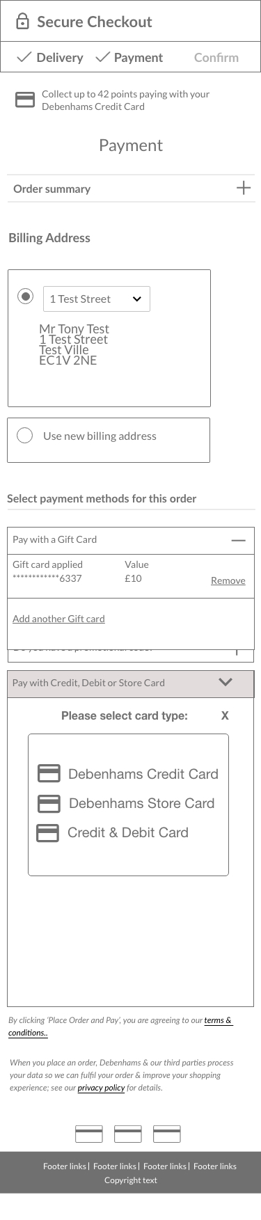
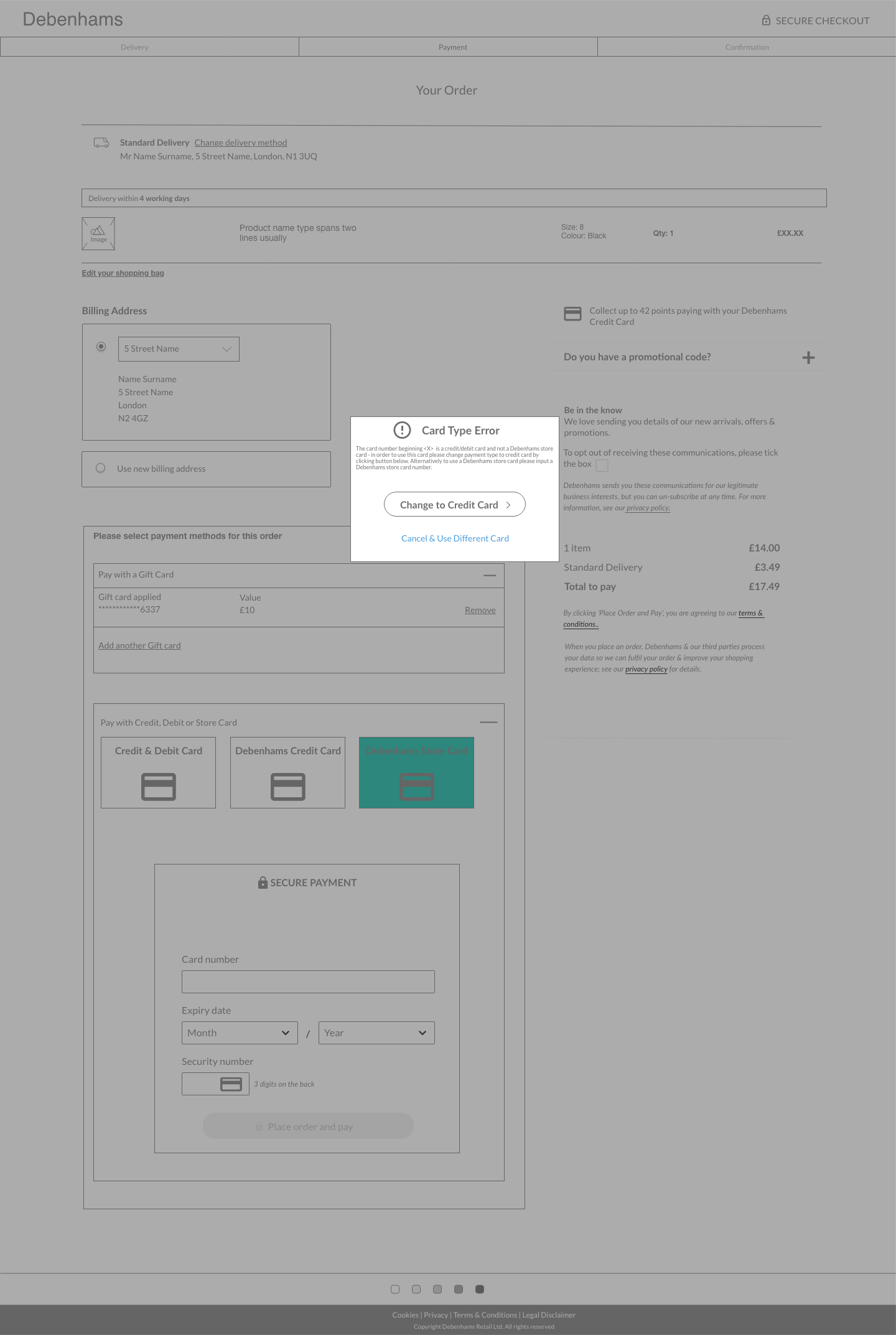
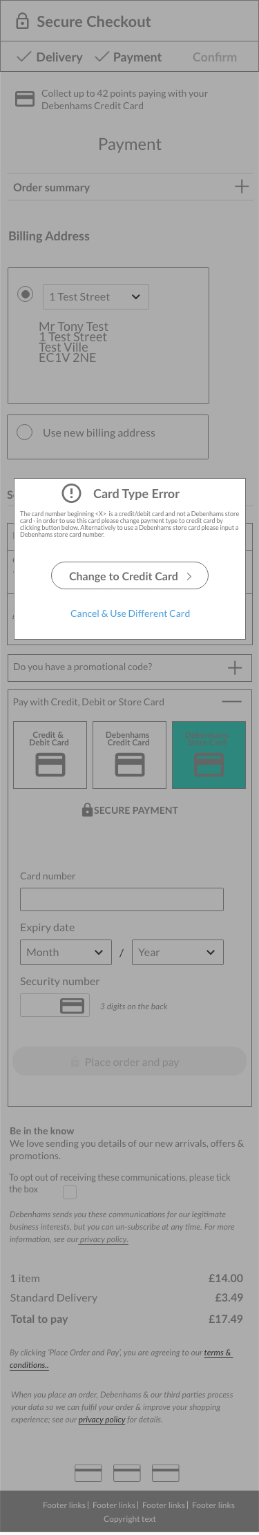
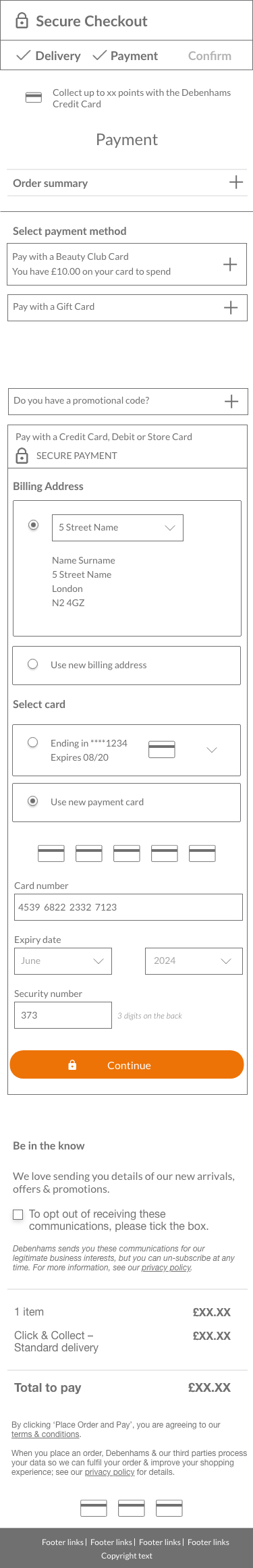
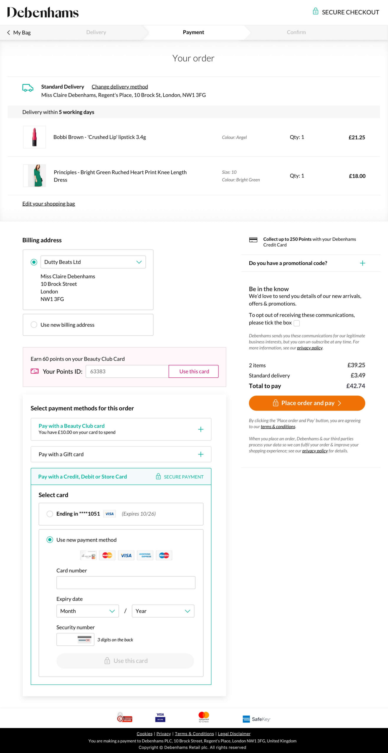
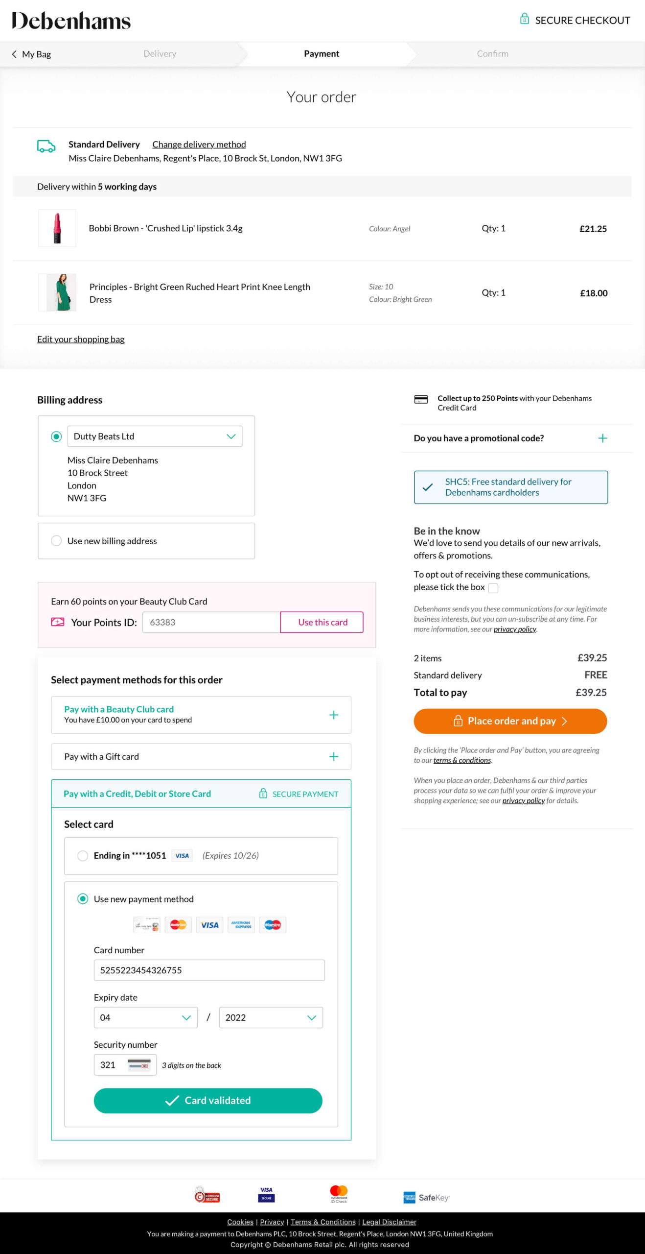
The verify card design solution stayed as close as possible to the existing checkout experience by NOT asking users to make a card type selection before entering payment details. This was the optimum design solution as it enabled me to overcome all five key UX challenges that wouldn’t fundamentally change the checkout user flow. I designed this by adding an additional “verify card” CTA that was essentially an additional masked step that would conduct a lookup between the iframe and existing backup systems to detect the card type. This would mean that I would overcome all five of the design challenges I found during the discovery phase with the most important being that this solution would no longer rely on the user to make the correct card choice and we could handle error messaging based on selection. The big caveat to this solution was that it was dependent on the business “re-carding” (sending replacement cards to existing customers) that have legacy cards that are unable to be processed down the iFrame route because of missing inputs on legacy cards such expiry dates and/or CVV.

Solution 2
Payment Selection Buttons
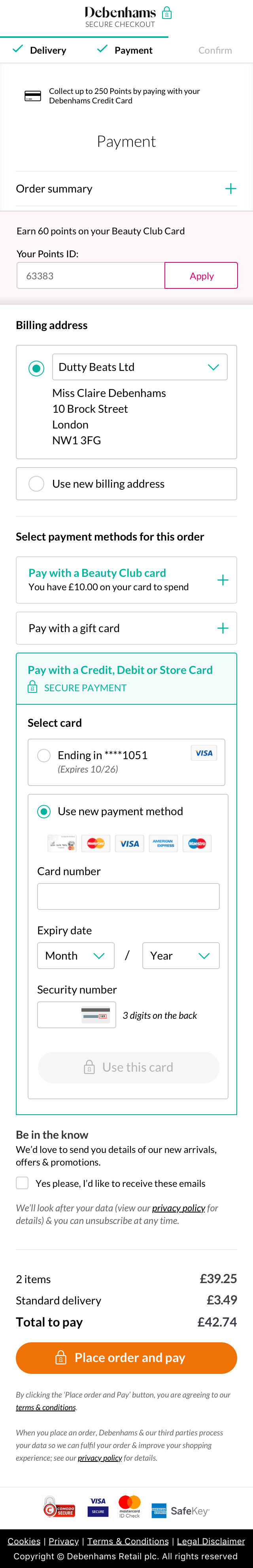
The button selection design solution was designed to ask users to make a card type selection before entering their payment details to detect card type and based on selection made would show two checkout funnels:
iFrame that could process regular credit cards
Existing experience that could process legacy Debenhams cards
This solution was aesthetically pleasing and was in keeping with the design system making use of buttons and eradicated the need of having more drop down menus that can be fiddly particularly on mobile devices. The main concern with this design solution was it was relying on the customer to make the correct card selection upfront which was not as easy as it sounds as there are so many different card types and designs. Also the terminology we used would have to be crystal clear so customers didn’t get confused e.g. customers could get confused between these two different card options “Debenhams Credit Card” vs “Credit Card”.

Solution 3
Drop Down Menu
The premise of the drop down design solution was the same as solution 2 but the styling was in the form of a drop down selection. I was not particularly keen on this solution as it was yet another drop down that can be less intuitive and often fiddly to use particularly on mobile devices.

Solution 4
Radio Buttons
The premise of the drop down design solution was the same as solution 2 but the styling was in the form of radio buttons.
Workshop
Now that I had come up with some solid design variants I held a UX workshop with key stakeholders on the project so I could showcase and explain my designs. In the workshop I conducted a dot analysis activity that enabled key stakeholders to voice their thoughts on each design variant by placing dots in a traffic light style voting system. This allowed the group to explore hypotheses inline with technical capabilities / constraints and agree on variants to develop moving forward. As a result of the workshop, we had agreed on the best way to proceed for each variant which was to produce a high fidelity prototype that I would user test.
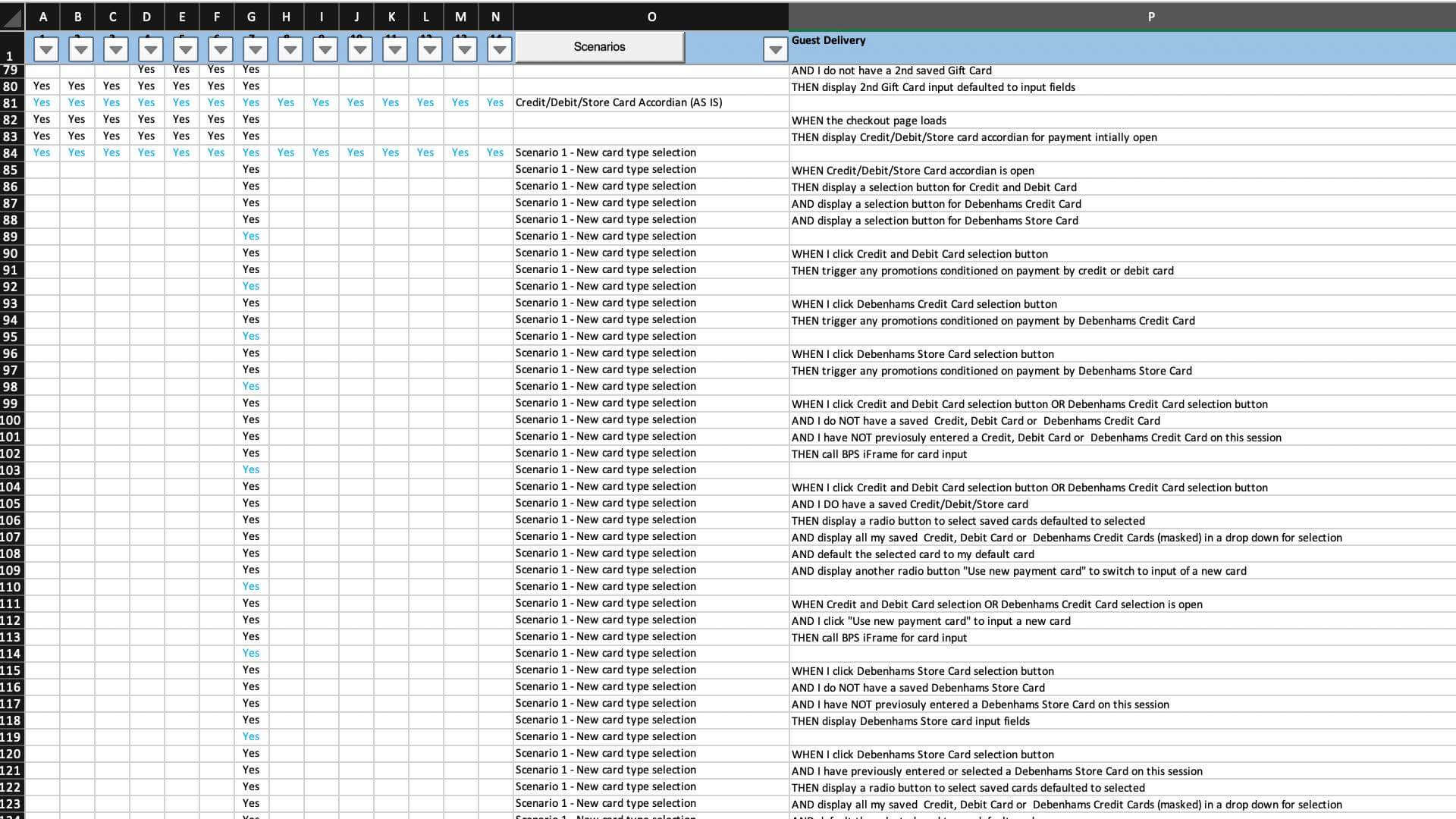
User Stories
Due to the intricate complexities of the checkout process, it was very important that I captured all the different scenarios that can occur that I would later factor the high fidelity prototype and end design. Working with our Business Analyst, we compiled a sortable user stories spreadsheet that captured all the key user journeys and consequently what components needed to be shown on screen and when based on dependencies.
High Fidelity Prototype
In order for me to test the different design variants I created a high Fidelity prototype for all five design variants including the existing checkout experience to act as the “control” variant. The variants were incredibly complex replicating interactions and UI of the existing Debenhams checkout experience.
User Testing
With the high fidelity prototype complete and ready for user testing, unfortunately due to serious unforeseen complications caused by the 2020 COVID pandemic, user testing with the planned CRM pool of customers had to be put on hold. This was due to a number of reasons – logical issues, remote working and mainly due to the business taking a cost saving measure and not renewing it’s contract with testing platform UserZoom. This was a big unforeseen hurdle as I wanted to validate my designs with real users so the business could be confident it was implementing the correct variant. However as a makeshift solution, I conducted some user testing internally to sense check my designs with staff from different departments. Overall, variant one with the “verify card” CTA performed best as some of the other variants through up usability issues with wrong card types being selected. Even though I had sense checked my designs internally, this never comes close to user testing on real customers and was a big frustration.
Stakeholder Showcase
With the final high fidelity prototype designs being finished, I showcased each of my UX solutions to all key internal stakeholders so they could understand my UX rationale inline with business requirements. The goal of the session was for the Senior Management Team to understand my proposed variants and therefore reach a decision on the solution to be developed. As part of the session, I made my final recommendation for the business to adopt solution 1 (“verify card” CTA) as it overcame the six key UX challenges identified in my discovery work and would cause very little user friction compared with the existing experience. Using MS Teams I ran a two hour demo of all four new variants with the group consisting of various members of Senior Management, Design, Development, BA and Technology teams.
SMT Decision & Sign Off
Having presented my designs and made my final recommendation to the business to adopt solution 1 (“verify card” CTA), I had to await the business’s decision. As mentioned earlier in this case study, the big caveat to adopting this solution was that it was dependent on the business “re-carding” (sending replacement cards) to existing customers that have legacy cards that are unable to be processed down the iFrame route because of missing inputs on legacy cards such expiry dates and/or CVV. This carried a large cost implication as the business would have to produce and send a large volume of cards to existing customers. However, even considering this implication I’m glad to report that the business agreed with my recommendation and made plans to re-card customers. This meant that we were in a position to produce the final UI to handover to development teams.
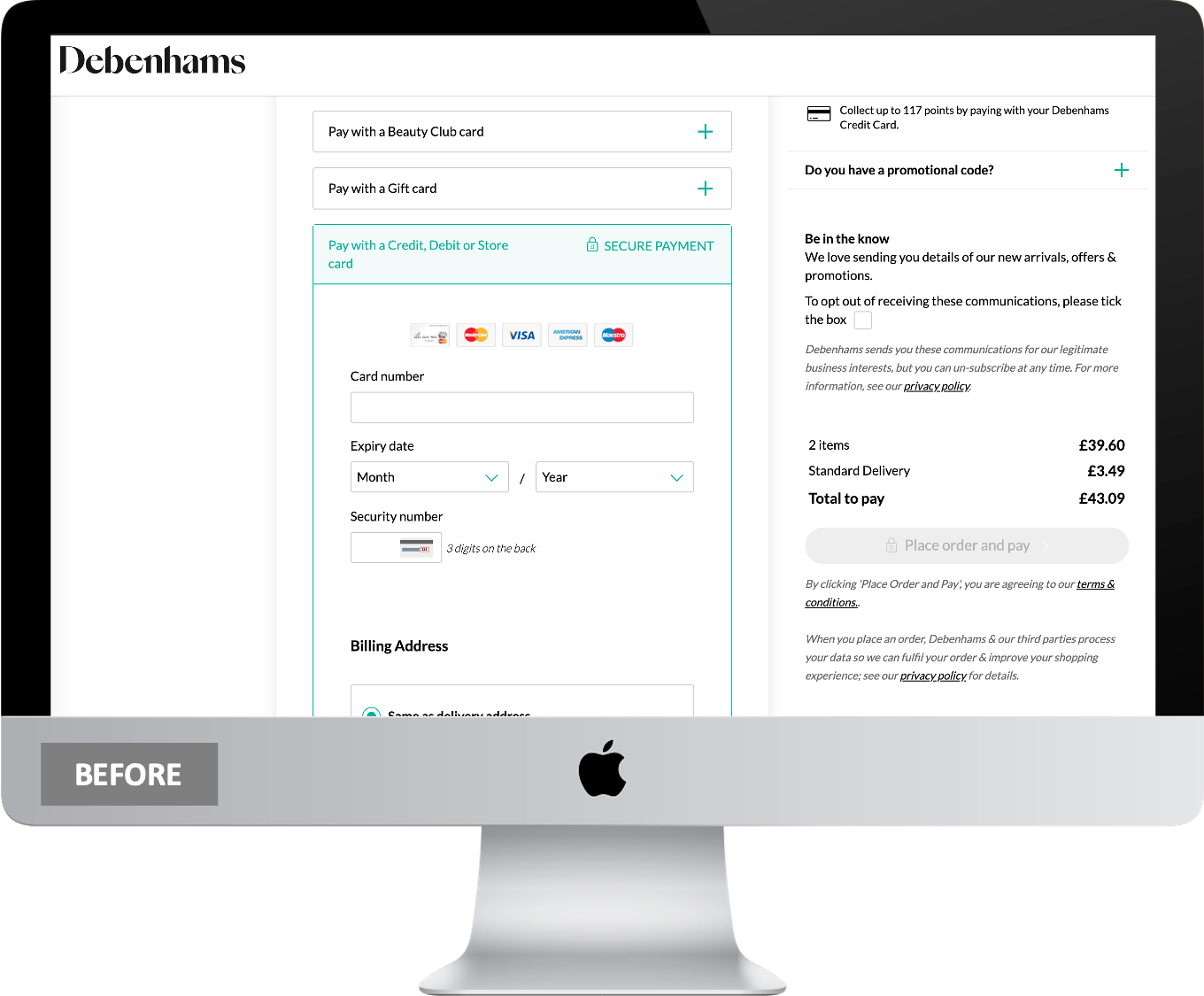
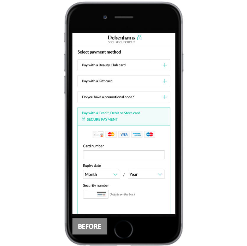
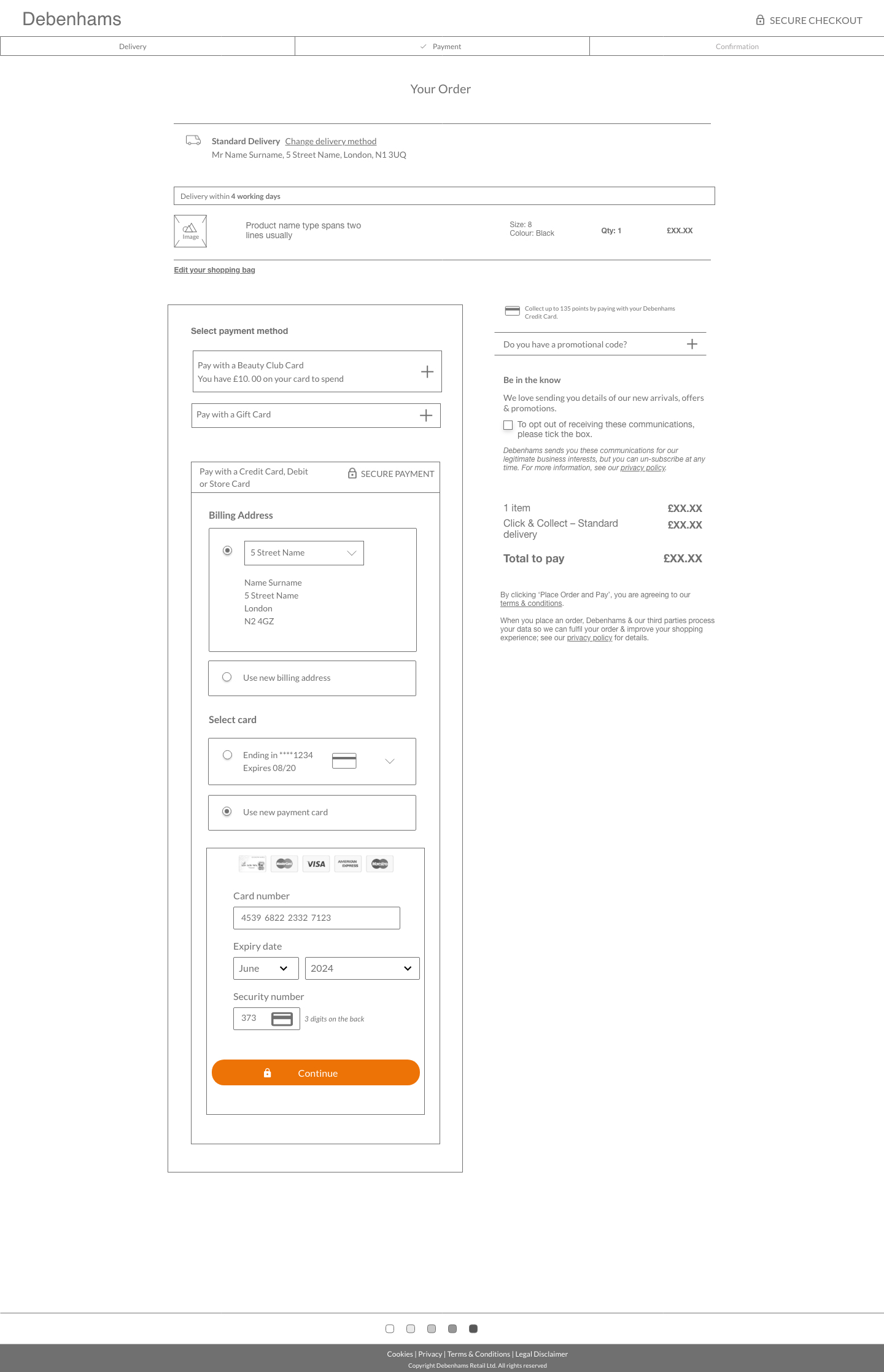
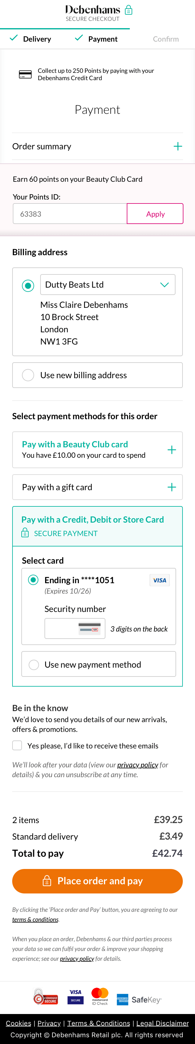
UI Screens
Now that the business had signed off solution 1, I worked with the UI team so they could replicate the designs ready to hand over to development.


Key UX Changes
Based on my UX research and the project requirements the following shows how I addressed the key UX challenges and factored them into my designs:
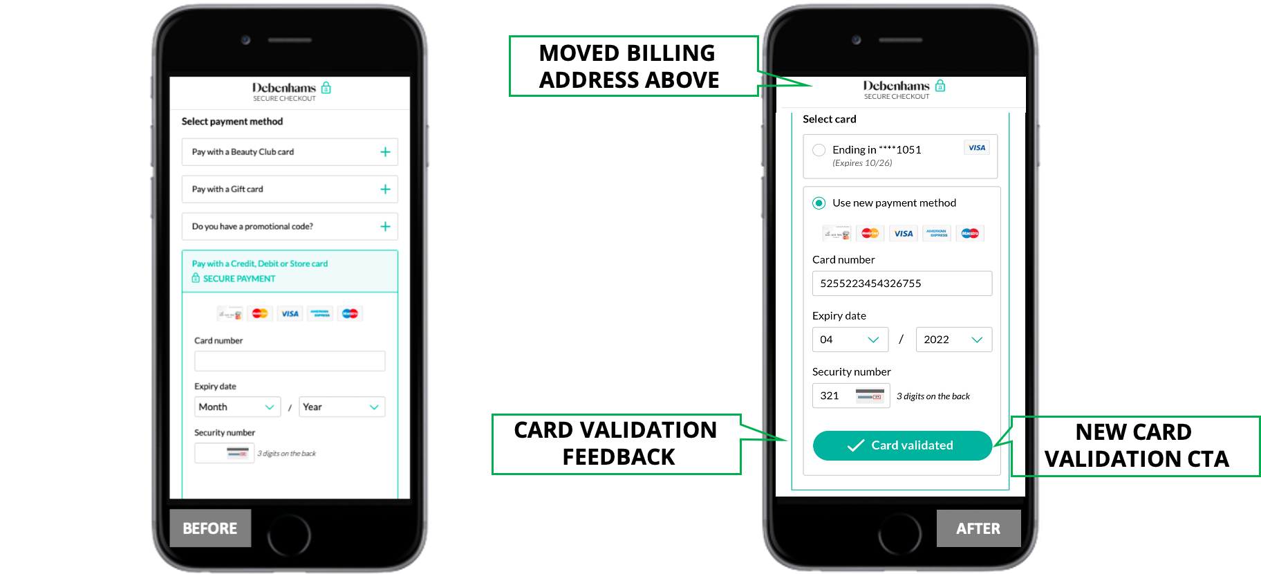
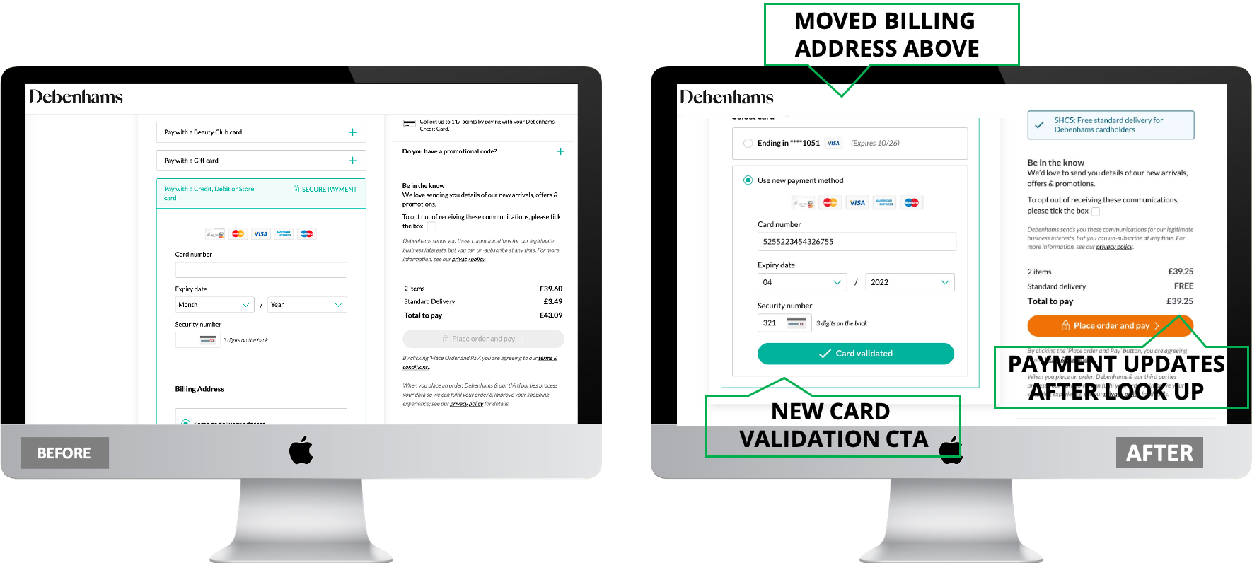
Single Step: By moving the billing address to appear before the user entered into the iFrame and by implementing a “verify card” CTA meant that I could keep the checkout payment step as is without having to add any additional steps which would allow more room for funnel drop off
Card Types: By implementing a “verify card” CTA that executed a look up in the background before the user clicks the final “pay” button handled card types without the user having to make a choice e.g. Button selection or dropdown
Reliant on User: Similarly the “verify card” CTA gave us back control allowing us to check card type rather than the user making a choice between two different payment lanes (iFrame and non-iFrame)
Wrong Route: Potential issue of customer selecting the wrong route and not being able to pay was eradicated as there was no longer two routes
Error Text: By working with the PSP, we use card bin ranges (using a sequence of card digits) during the card look up that allowed us to serve any custom error messaging required
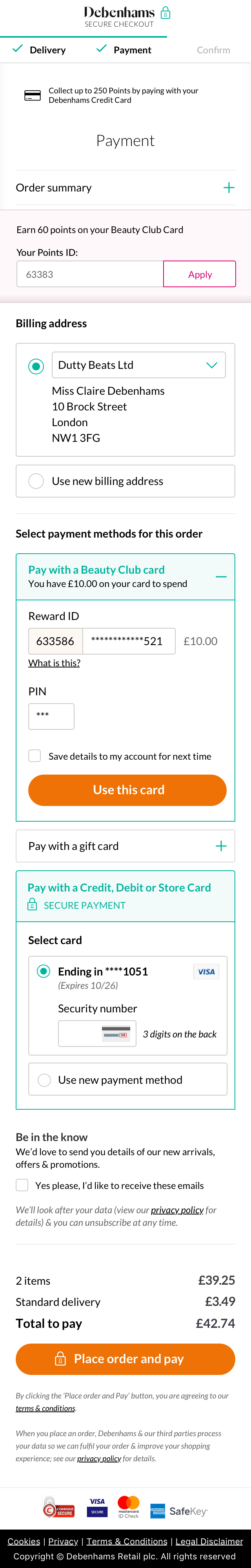
Saved Cards: I handled “Tokenised” cards by adding radio button options for any saved cards
LEARNINGS
Learnings
While the whole project was extremely complex and proved to be a huge learning experience, it was an unusual project as it got caught in the midst of the 2020 Covid Pandemic causing some real working constraints. Most of all the inability to conduct the planned extensive user testing with real Debenhams customers that would’ve taken any ambiguity out of my designs. Even though I tried to combat this with some internal testing, this doesn’t come close to my usual practice of always user testing on real customers. Unfortunately in this rare unprecedented instance this wasn’t possible, however, I believe that I put forward the best possible UX design that met both the user and business needs.
I especially enjoyed finding solutions to tackle the key UX challenges I found during the discovery phase. As my designs were touching the most sensitive part of the website, the checkout, I found it rewarding that the project was so far reaching with a vested interest from the senior management team. In turn it felt good to get buy in from the senior management team to adopt my proposed solution considering the cost implications.